Types of Trendlines in Excel
Last Updated : 01 Jun, 2021
A line that bounds a particular chart and shows the behavior as it propagates is known as a trend line. It is generally used for analytics purposes to get a close approximate idea from the chart. The chart can be of any type like Bar Chart, Scattered Chart, Line Chart, etc.
In this article, we are going to see different types of Trendlines in Excel using some practical real-life examples :
 Types of Trendlines
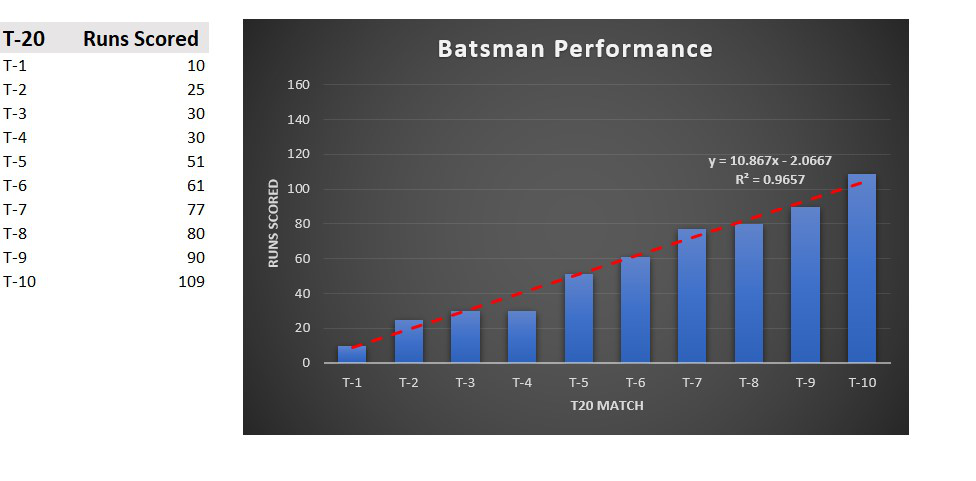
 1. Linear Trendline : Linear trendlines are mostly used when the data sets are linear in nature. It can be linearly increasing which describes a rise in the data or linearly decreasing which describes a fall in the data. It is of the type :
y=mx+c m : Slope of the line y c : Intercept of the line
Example: The below linear trendline shows the performance of a batsman in a T20 match. The linear trendline is rising with the number of matches played. This shows the player performed well gradually in all the matches and the runs scored kept on increasing.
2. Polynomial Trendline: Polynomial trendline is used when the dataset is changing values rapidly i.e. sometimes increasing or decreasing more than once. It is of the type :

The degree of a polynomial is the largest power of x. In the trendline the number of bends is dependent on the degree number. By default, the order will be 2 as we can see in "Order". The number of bends or hills will increase as you increase the Order value.
Example : The below polynomial trendline shows the performance of a batsman in eight contiguous matches. We can see a rise in the number of runs scored and then reached a peak value and again fallen. So for such types of data sets the polynomial trendline is mostly used.

3. Exponential Trendline: It is mostly used when there is a rise or fall in the dataset exponentially. It is of the type :

Example : Consider a survey which consists of the number of people suffering from a deadly disease. The number of positive cases per month from January to July is the data set here. We can infer from the below chart that the number of cases are exponentially declining till July.

4. Logarithmic Trendline: The best-fit line is mostly used for datasets that either increase or decrease and then maintain a constant level. It is basically the inverse of the exponential trendline. It is of the type :

Example: Consider a survey about the number of people taking vaccines per month. We can see that it is growing and then level off in June and July. We can infer from the below chart that by June maximum people have started to take vaccines.

5. Power Trendline: It is mostly used for datasets that increase at a particular rate, It is more symmetrical and is somewhat similar to the exponential type of curve. It is of the type :

Example: Consider the runs scored by a batsman in ten consecutive test matches. We can infer from the below chart that the performance of the player has increased gradually as he played more matches.

6. Moving Average Trendline : When there are a lot of oscillations i.e. rapid up and down in the values of the datasets, the moving average trendline can be used to make a smooth and effective line around the chart to see the growth and fall of the data. In Excel by default, the Period of the trendline is set to 2. As we increase the value of the Period the line becomes more effective and surrounds the chart. It gets a smooth bend and curves on increasing the Period value.
For example: Consider the performance of a batsman in ten consecutive IPL matches. We can see the performance of the player is not constant and there is rise or fall in the runs scored and also in one of the matches he was out for a duck.

Similar Reads
Types of Trendlines in Google Sheet Analyze your data with trendlines in Google Sheets! Understanding the various types of trendlines—linear, exponential, logarithmic, polynomial, and moving average—can greatly improve your ability to analyze and present information. Whether you're tracking sales, analyzing market trends, or forecasti
6 min read
Sparklines in Excel : Add, Types, Delete The sparklines are also known as in-line charts. So the question is where do we use sparklines, we can use them in situations where we want the graph/chart to be as near to the data as possible. Mainly we write data in one row / one column and add a sparkline to the end of the row or end of the colu
10 min read
Types of Charts in Excel Visualizing data is a key part of effective analysis, and Excel offers a wide range of tools to help you present information clearly. Understanding the different types of charts in Excel can help you choose the best way to display your data based on your goals and audience. From simple visuals like
3 min read
How to Add Trendline in Excel Chart Add Trendline in Excel Chart - A Trendline is an additional line that indicates the slope (or trend) in a particular data series and is also known as a line of best fit. Trendlines can be helpful when you are analyzing data because they can forecast future values based on your current data. Not all
3 min read
Excel Chart with Two Trendlines A line that bounds a particular chart and shows the behavior as it propagates is known as a trend line. It is generally used for analytics purposes to get a close approximate idea from the chart. The chart can be of any type like Bar Chart, Scattered Chart, Line Chart, etc. In this article, we are g
4 min read