Skip to content
geeksforgeeks
  • Tutorials
    • Python
    • Java
    • Data Structures & Algorithms
    • ML & Data Science
    • Interview Corner
    • Programming Languages
    • Web Development
    • CS Subjects
    • DevOps And Linux
    • School Learning
    • Practice Coding Problems
  • Courses
    • DSA to Development
    • Get IBM Certification
    • Newly Launched!
      • Master Django Framework
      • Become AWS Certified
    • For Working Professionals
      • Interview 101: DSA & System Design
      • Data Science Training Program
      • JAVA Backend Development (Live)
      • DevOps Engineering (LIVE)
      • Data Structures & Algorithms in Python
    • For Students
      • Placement Preparation Course
      • Data Science (Live)
      • Data Structure & Algorithm-Self Paced (C++/JAVA)
      • Master Competitive Programming (Live)
      • Full Stack Development with React & Node JS (Live)
    • Full Stack Development
    • Data Science Program
    • All Courses
  • Pandas
  • Matplotlib
  • Plotly
  • Altair
  • Bokeh
  • Data Analysis
  • R
  • Machine Learning Math
  • Machin Learning
  • Deep Learning
  • Deep Learning Projects
  • NLP
  • Computer vision
  • Data science
  • Deep learning interview question
  • Machin Learning Interview question
Open In App
Next Article:
KDE Plot Visualization with Pandas and Seaborn
Next article icon

Seaborn Kdeplot – A Comprehensive Guide

Last Updated : 20 Dec, 2023
Comments
Improve
Suggest changes
Like Article
Like
Report

Kernel Density Estimate (KDE) Plot is a powerful tool for estimating the probability density function of continuous or non-parametric data. KDE plot is implemented through the kdeplot function in Seaborn. This article explores the syntax and usage of kdeplot in Python, focusing on one-dimensional and bivariate scenarios for efficient data visualization.

Table of Content

  • What is KDE plot?
  • How to visualize KDE Plot using Seaborn?
  • KDE Plot of Iris Dataset
  • Conclusion
  • Frequently Asked Questions (FAQs)

What is KDE plot?

Kernel Density Estimate (KDE) Plot allows to estimate the probability density function of the continuous or non-parametric from our data set curve in one or more dimensions it means we can create plot a single graph for multiple samples which helps in more efficient data visualization.

In order to use the Seaborn module, we need to install the module using the below command:

!pip install seaborn

Syntax: seaborn.kdeplot(x=None, *, y=None, vertical=False, palette=None, **kwargs)

Parameters:

x, y : vectors or keys in data

vertical : boolean (True or False)

data : pandas.DataFrame, numpy.ndarray, mapping, or sequence

How to visualize KDE Plot using Seaborn?

We learn the usage of some parameters through some specific examples:

Importing Libraries

First import the corresponding library

Python3
import pandas as pd import seaborn as sb import numpy as np from matplotlib import pyplot as plt %matplotlib inline 

Draw a simple one-dimensional kde image:

Let's see the Kde of our variable x-axis and y-axis, so let pass the x variable into the kdeplot() methods.

Python3
# data x and y axis for seaborn x= np.random.randn(200) y = np.random.randn(200)  # Kde for x var sns.kdeplot(x) 

Output:

Then after check for y-axis.

Python3
sns.kdeplot(y) 

Output:

Use Shade to fill the area covered by curve:

We can highlight the plot using shade to the area covered by the curve. If True, shadow processing is performed in the area below the kde curve, and color controls the color of the curve and shadow.

Python3
sns.kdeplot(x, shade = True) 

Output:

You can change the Shade color with color attributes:

Python3
sns.kdeplot(x, shade = True , color = "Green") 

Output:
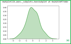
Use Vertical to draw indicates whether to draw on the X axis or on the Y axis

Python3
sns.kdeplot(x, vertical = True) 

Output:

Bivariate Kdeplot for two variables: 

Simple pass the two variables into the seaborn.kdeplot() methods.

Python3
sns.kdeplot(x,y) 

Output:

Shade the area covered by a curve with shade attributes:

Python3
sns.kdeplot(x,y, shade = True) 

Output:

Now you can change the color with cmap attributes:

Python3
sns.kdeplot(x,y, cmap = "winter_r") 

Output:

Use of Cbar: If True, add a colorbar to annotate the color mapping in a bivariate plot. Note: Does not currently support plots with a hue variable well.

Python3
sns.kdeplot(x, y, shade=True, cbar=True) 

Output:


KDE Plot of Iris Dataset

Let see the example with Iris Dataset which is plot distributions for each column of a wide-form dataset:

Iris data set consists of 3 different types of irises’ (Setosa, Versicolour, and Virginica) petal and sepal length, stored in a 150x4 numpy.ndarray

Loading the iris dataset for Kdeplot:

Python3
iris = sns.load_dataset('iris') iris 

Output:

Bivariate Kdeplot for two variables of iris:

Once we have species set then if we want to simply calculate the petal_length and petal_width then Simple pass the two variables(Setosa and virginica ) into the seaborn.kdeplot() methods.

Python3
setosa = iris.loc[iris.species=="setosa"] virginica = iris.loc[iris.species == "virginica"] sns.kdeplot(setosa.petal_length, setosa.petal_width) 

Output:

See another example if we want to calculate another variable attribute which is sepal_width and sepal_length.

Python3
sns.kdeplot(setosa.sepal_width, setosa.sepal_length) 

Output:

If we pass the two separate Kdeplot with different variable:

Python3
sns.kdeplot(setosa.petal_length, setosa.petal_width) sns.kdeplot(virginica.petal_length, virginica.petal_width) 

Output:

Conclusion

In summary, kdeplot in Seaborn offers a versatile approach to visualize probability density functions, aiding in the exploration of one or more dimensions in datasets. Whether shading areas, adjusting colors, or applying it to real-world datasets like Iris, kdeplot stands as a valuable tool for data scientists and analysts.


Next Article
KDE Plot Visualization with Pandas and Seaborn

K

kumar_satyam
Improve
Article Tags :
  • Data Science
  • python
  • Python-Seaborn
Practice Tags :
  • python

Similar Reads

    Introduction

    Python Seaborn Tutorial
    Seaborn is a library mostly used for statistical plotting in Python. It is built on top of Matplotlib and provides beautiful default styles and color palettes to make statistical plots more attractive.In this tutorial, we will learn about Python Seaborn from basics to advance using a huge dataset of
    15+ min read
    Introduction to Seaborn - Python
    Prerequisite - Matplotlib Library Visualization is an important part of storytelling, we can gain a lot of information from data by simply just plotting the features of data. Python provides a numerous number of libraries for data visualization, we have already seen the Matplotlib library in this ar
    5 min read
    Plotting graph using Seaborn | Python
    This article will introduce you to graphing in Python with Seaborn, which is the most popular statistical visualization library in Python. Installation: The easiest way to install seaborn is to use pip. Type following command in terminal:   pip install seaborn OR, you can download it from here and i
    7 min read

    Styling Plots

    Seaborn | Style And Color
    Seaborn is a statistical plotting library in python. It has beautiful default styles. This article deals with the ways of styling the different kinds of plots in seaborn.  Seaborn Figure Styles This affects things like the color of the axes, whether a grid is enabled by default, and other aesthetic
    4 min read
    Seaborn - Color Palette
    In this article, We are going to see seaborn color_palette(), which can be used for coloring the plot. Using the palette we can generate the point with different colors. Example:Pythonimport seaborn as sns import matplotlib.pyplot as plt # Set a Seaborn color palette sns.set_palette("Set2") # Create
    3 min read

    Multiple Plots

    Python - seaborn.FacetGrid() method
    Prerequisite: Seaborn Programming Basics Seaborn is a Python data visualization library based on matplotlib. It provides a high-level interface for drawing attractive and informative statistical graphics. Seaborn helps resolve the two major problems faced by Matplotlib; the problems are ? Default Ma
    3 min read
    Python - seaborn.PairGrid() method
    Prerequisite: Seaborn Programming Basics Seaborn is a Python data visualization library based on matplotlib. It provides a high-level interface for drawing attractive and informative statistical graphics. Seaborn helps resolve the two major problems faced by Matplotlib; the problems are ? Default Ma
    3 min read

    Scatter Plot

    Scatterplot using Seaborn in Python
    Seaborn is an amazing visualization library for statistical graphics plotting in Python. It provides beautiful default styles and color palettes to make statistical plots more attractive. It is built on the top of matplotlib library and also closely integrated into the data structures from pandas.Wh
    4 min read
    Visualizing Relationship between variables with scatter plots in Seaborn
    To understand how variables in a dataset are related to one another and how that relationship is dependent on other variables, we perform statistical analysis. This Statistical analysis helps to visualize the trends and identify various patterns in the dataset. One of the functions which can be used
    2 min read
    How To Make Scatter Plot with Regression Line using Seaborn in Python?
    In this article, we will learn how to male scatter plots with regression lines using Seaborn in Python. Let's discuss some concepts : Seaborn : Seaborn is a tremendous visualization library for statistical graphics plotting in Python. It provides beautiful default styles and color palettes to make s
    2 min read
    Scatter Plot with Marginal Histograms in Python with Seaborn
    Prerequisites: Seaborn  Scatter Plot with Marginal Histograms is basically a joint distribution plot with the marginal distributions of the two variables. In data visualization, we often plot the joint behavior of two random variables (bi-variate distribution) or any number of random variables. But
    2 min read

    Line Plot

    Data Visualization with Seaborn Line Plot
    Prerequisite: SeabornMatplotlib  Presenting data graphically to emit some information is known as data visualization. It basically is an image to help a person interpret what the data represents and study it and its nature in detail. Dealing with large scale data row-wise is an extremely tedious tas
    4 min read
    Creating A Time Series Plot With Seaborn And Pandas
    In this article, we will learn how to create A Time Series Plot With Seaborn And Pandas. Let's discuss some concepts : Pandas is an open-source library that's built on top of NumPy library. It's a Python package that gives various data structures and operations for manipulating numerical data and st
    4 min read
    How to Make a Time Series Plot with Rolling Average in Python?
    Time Series Plot is used to observe various trends in the dataset over a period of time. In such problems, the data is ordered by time and can fluctuate by the unit of time considered in the dataset (day, month, seconds, hours, etc.). When plotting the time series data, these fluctuations may preven
    4 min read

    Bar Plot

    Barplot using seaborn in Python
    Seaborn is an amazing visualization library for statistical graphics plotting in Python. It provides beautiful default styles and color palettes to make statistical plots more attractive. It is built on the top of matplotlib library and also closely integrated to the data structures from pandas.  Se
    6 min read
    Seaborn - Sort Bars in Barplot
    Prerequisite: Seaborn, Barplot In this article, we are going to see how to sort the bar in barplot using Seaborn in python. Seaborn is an amazing visualization library for statistical graphics plotting in Python. It provides beautiful default styles and color palettes to make statistical plots more
    3 min read

    Count Plot

    seaborn.countplot() in Python
    seaborn.countplot() is a function in the Seaborn library in Python used to display the counts of observations in categorical data. It shows the distribution of a single categorical variable or the relationship between two categorical variables by creating a bar plot. Example:Pythonimport seaborn as
    8 min read

    Box Plot

    Boxplot using Seaborn in Python
    Boxplot is used to see the distribution of numerical data and identify key stats like minimum and maximum values, median, identifying outliers, understanding how data is distributed and can compare the distribution of data across different categories or variables. In Seaborn the seaborn.boxplot() fu
    3 min read
    Horizontal Boxplots with Seaborn in Python
    Prerequisite: seaborn The Boxplots are used to visualize the distribution of data which is useful when a comparison of data is required. Sometimes, Boxplot is also known as a box-and-whisker plot. The box shows the quartiles of dataset and whiskers extend to show rest of the distribution. In this ar
    1 min read
    Seaborn - Coloring Boxplots with Palettes
    Adding the right set of color with your data visualization makes it more impressive and readable, seaborn color palettes make it easy to use colors with your visualization. In this article, we will see how to color boxplot with seaborn color palettes also learn the uses of seaborn color palettes and
    2 min read
    How to Show Mean on Boxplot using Seaborn in Python?
    A boxplot is a powerful data visualization tool used to understand the distribution of data. It splits the data into quartiles, and summarises it based on five numbers derived from these quartiles: median: the middle value of data. marked as Q2, portrays the 50th percentile.first quartile: the middl
    2 min read
    How To Manually Order Boxplot in Seaborn?
    Seaborn is an amazing visualization library for statistical graphics plotting in Python. It provides beautiful default styles and color palettes to make statistical plots more attractive. It is built on the top of matplotlib library and also closely integrated into the data structures from pandas.Se
    3 min read
    Grouped Boxplots in Python with Seaborn
    Boxplot depicts the distribution of quantitative data facilitating comparisons between different variables, continuous or categorical. It is a common data dispersion measure. Boxplots consist of a five-number summary which helps in detecting and removing outliers from the dataset. Minimum observatio
    2 min read
    Box plot visualization with Pandas and Seaborn
    Box Plot is the visual representation of the depicting groups of numerical data through their quartiles. Boxplot is also used for detect the outlier in data set. It captures the summary of the data efficiently with a simple box and whiskers and allows us to compare easily across groups. Boxplot summ
    3 min read

    Violin Plot

    Violinplot using Seaborn in Python
    Seaborn is an amazing visualization library for statistical graphics plotting in Python. It provides beautiful default styles and color palettes to make statistical plots more attractive. It is built on the top of matplotlib library and also closely integrated into the data structures from pandas. V
    6 min read
    How to Make Horizontal Violin Plot with Seaborn in Python?
    In this article, we are going to plot a horizontal Violin plot with seaborn. We can use two methods for the Drawing horizontal Violin plot, Violinplot() and catplot(). Method 1: Using violinplot() A violin plot plays a similar activity that is pursued through whisker or box plot do. As it shows seve
    3 min read
    How to Make Grouped Violinplot with Seaborn in Python?
    This article depicts how to make a grouped violinplot with Seaborn in python. Violinplot is a great way of visualizing the data as a combination of the box plot with the kernel density plots to produce a new type of plot.  For this article, we will be using the iris dataset to plot data. This comes
    3 min read

    Strip Plot

    Stripplot using Seaborn in Python
    Seaborn is an amazing visualization library for statistical graphics plotting in Python. It provides beautiful default styles and color palettes to make statistical plots more attractive. It is built on top of the matplotlib library and also closely integrated into the data structures from pandas. S
    5 min read
geeksforgeeks-footer-logo
Corporate & Communications Address:
A-143, 7th Floor, Sovereign Corporate Tower, Sector- 136, Noida, Uttar Pradesh (201305)
Registered Address:
K 061, Tower K, Gulshan Vivante Apartment, Sector 137, Noida, Gautam Buddh Nagar, Uttar Pradesh, 201305
GFG App on Play Store GFG App on App Store
Advertise with us
  • Company
  • About Us
  • Legal
  • Privacy Policy
  • In Media
  • Contact Us
  • Advertise with us
  • GFG Corporate Solution
  • Placement Training Program
  • Languages
  • Python
  • Java
  • C++
  • PHP
  • GoLang
  • SQL
  • R Language
  • Android Tutorial
  • Tutorials Archive
  • DSA
  • Data Structures
  • Algorithms
  • DSA for Beginners
  • Basic DSA Problems
  • DSA Roadmap
  • Top 100 DSA Interview Problems
  • DSA Roadmap by Sandeep Jain
  • All Cheat Sheets
  • Data Science & ML
  • Data Science With Python
  • Data Science For Beginner
  • Machine Learning
  • ML Maths
  • Data Visualisation
  • Pandas
  • NumPy
  • NLP
  • Deep Learning
  • Web Technologies
  • HTML
  • CSS
  • JavaScript
  • TypeScript
  • ReactJS
  • NextJS
  • Bootstrap
  • Web Design
  • Python Tutorial
  • Python Programming Examples
  • Python Projects
  • Python Tkinter
  • Python Web Scraping
  • OpenCV Tutorial
  • Python Interview Question
  • Django
  • Computer Science
  • Operating Systems
  • Computer Network
  • Database Management System
  • Software Engineering
  • Digital Logic Design
  • Engineering Maths
  • Software Development
  • Software Testing
  • DevOps
  • Git
  • Linux
  • AWS
  • Docker
  • Kubernetes
  • Azure
  • GCP
  • DevOps Roadmap
  • System Design
  • High Level Design
  • Low Level Design
  • UML Diagrams
  • Interview Guide
  • Design Patterns
  • OOAD
  • System Design Bootcamp
  • Interview Questions
  • Inteview Preparation
  • Competitive Programming
  • Top DS or Algo for CP
  • Company-Wise Recruitment Process
  • Company-Wise Preparation
  • Aptitude Preparation
  • Puzzles
  • School Subjects
  • Mathematics
  • Physics
  • Chemistry
  • Biology
  • Social Science
  • English Grammar
  • Commerce
  • World GK
  • GeeksforGeeks Videos
  • DSA
  • Python
  • Java
  • C++
  • Web Development
  • Data Science
  • CS Subjects
@GeeksforGeeks, Sanchhaya Education Private Limited, All rights reserved
We use cookies to ensure you have the best browsing experience on our website. By using our site, you acknowledge that you have read and understood our Cookie Policy & Privacy Policy
Lightbox
Improvement
Suggest Changes
Help us improve. Share your suggestions to enhance the article. Contribute your expertise and make a difference in the GeeksforGeeks portal.
geeksforgeeks-suggest-icon
Create Improvement
Enhance the article with your expertise. Contribute to the GeeksforGeeks community and help create better learning resources for all.
geeksforgeeks-improvement-icon
Suggest Changes
min 4 words, max Words Limit:1000

Thank You!

Your suggestions are valuable to us.

What kind of Experience do you want to share?

Interview Experiences
Admission Experiences
Career Journeys
Work Experiences
Campus Experiences
Competitive Exam Experiences