Python has become one of the most popular programming languages for data science because of its vast collection of libraries. In data science, data visualization plays a crucial role that helps us to make it easier to identify trends, patterns, and outliers in large data sets. Pygal is best suited for Data visualizations. It is used to draw charts and plots such as bar plots, line charts, and box plots.
What is Pygal?
Pygal is open source Python library that is specifically designed to create interactive and visually appealing charts and plots. It is used to create a wide range of chart types, including bar charts, line charts, pie charts, radar charts, scatter plots, and more. We can customize the graphs using various styles, colors, and labels to make them more interactive. Pygal allows saving the output in SVG(Scalable Vector Graphics).
Key Features of Pygal Library
- In Pygal, we can create a wide range of charts and plots which include line charts, pie charts, bar plots, radar charts, and more. We can choose any of those that are best suited to represent and visualize our data set.
- Plots and Charts are more interactive in Pygal as it provides data point highlighting, tooltips, and zoom features that make them more informative to the users.
- Pygal connects seamlessly with a variety of data sources, including CSV files, databases, and API answers. This integration feature ensures that the data analysis workflow is as smooth and efficient as possible.
- Pygal allows extensive customization of colors, fonts, legends, and other visual elements while it also provides pre-designed themes that are best suited to the visualization.
Checking the Python Version
The Pygal library is available for Python 3.6, 3.7, 3.8, 3.9, and pypy. So, It is important to install Python 3.6 or a later version in our system we can also check the version already installed python version by executing the below command in the terminal.
python --version
Installing Pygal
To use the features of Pygal library it should be installed on our system. To install Pygal execute the below command in a terminal or command prompt and if pip command is not working refer to pip install.
pip install pygal
How to use Pygal in Python?
To use the Pygal library we have to first import it into our Python Program using the import command and then we have to create the instance of plot or chart. In the below example, we have created the instance of a bar plot using pygal.Bar() method. After that, we created the Bar Chart by passing adding some random data and saving the bar chart as a 'BarPlot.svg' file using the render_to_file() method.
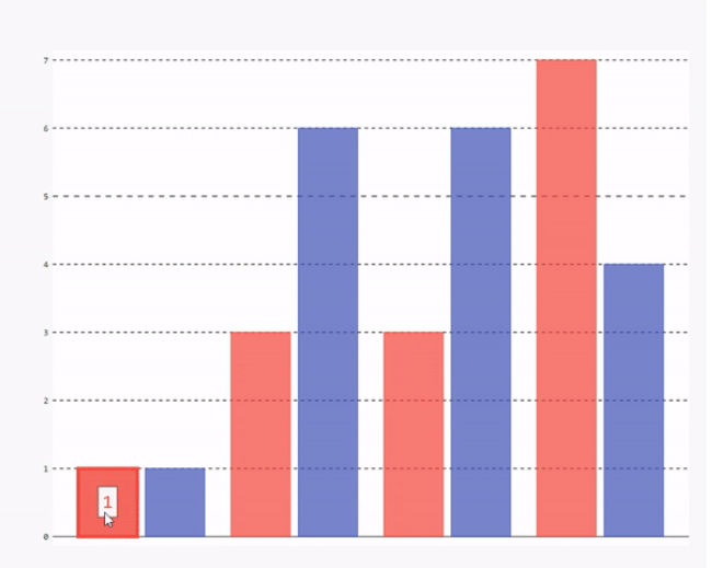
Python3 # import Pygal module import pygal # Creating an instance of Bar Plot Bar_plot = pygal.Bar() # Creating a bar Plot using random data Bar_plot(1, 3, 3, 7)(1, 6, 6, 4).render_to_file('BarPlot.svg') Output: We can see in the below output that when we hover over the bar it shows data of that bar.
Examples of Creating Charts and Plots using Pygal in Python
Now we will see some examples of creating interactive Charts and Plots using Pygal in Python.
Create a Pie Chart using Pygal in Python
In the below example, we will draw a pie chart using the Pygal library. First, we import the Pygal library, and then create an instance of a pie chart using pygal.Pie() method. Set the title of a pie chart. Add data to the pie chart using add() method by passing the label name and value as an argument in it. Finally, save the output to the SVG file.
Python3 # importing pygal import pygal # Creating Pie chart object pie_chart = pygal.Pie() # Set the title of pie chart pie_chart.title = '% of different section in SDE Interview' # Add data to pie chart pie_chart.add('Aptitude', 10) pie_chart.add('OOPs', 20) pie_chart.add('DSA', 40) pie_chart.add('Project', 30) # Render the bar chart to SVG file pie_chart.render_to_file('Pie_chart.svg') Output:

Create a Stacked Line Chart using Pygal in Python
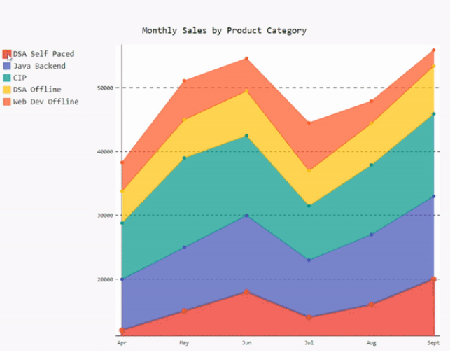
In the below example, we will draw a stacked line chart using the Pygal library. First, we import the Pygal library and then create sample data of 6 months' sales of various courses at GFG. Create an instance of a stacked line chart using pygal.StackedLine() method and set fill as true so that the area between two lines or a line and the x-axis is filled with color. Set the title of a pie chart and x-axis labels. Add data to the pie chart using add() method by passing the label name and value as an argument in it. Finally, save the output to the SVG file.
Python3 import pygal # Sample Sales data for different cources on GFG months = ['Apr', 'May', 'Jun', 'Jul', 'Aug', 'Sept'] DSA_Self_Paced = [12000, 15000, 18000, 14000, 16000, 20000] Java_Backend = [8000, 10000, 12000, 9000, 11000, 13000] CIP = [8800, 14000, 12500, 8500, 10900, 12900] DSA_Offline = [5000, 6000, 7000, 5500, 6500, 7500] Web_Dev_Offline = [4500, 6100, 5100, 7500, 3500, 2500] # Create a stacked line chart line_chart = pygal.StackedLine(fill=True) # Title and labels line_chart.title = 'Monthly Sales by Product Category' line_chart.x_labels = months # Add data to the chart line_chart.add('DSA Self Paced', DSA_Self_Paced) line_chart.add('Java Backend', Java_Backend) line_chart.add('Complete Interview Preparation', CIP) line_chart.add('DSA Offline', DSA_Offline) line_chart.add('Web Dev Offline', Web_Dev_Offline) # Save the chart to a file line_chart.render_to_file('stacked_line_chart.svg') Output:
Similar Reads
Python - Data visualization tutorial Data visualization is a crucial aspect of data analysis, helping to transform analyzed data into meaningful insights through graphical representations. This comprehensive tutorial will guide you through the fundamentals of data visualization using Python. We'll explore various libraries, including M
7 min read
What is Data Visualization and Why is It Important? Data visualization is the graphical representation of information and data. It uses visual elements like charts, graphs and maps to help convey complex information in a way that is easy to understand and interpret. By transforming large datasets into visuals, it allows decision-makers to spot trends
5 min read
Data Visualization using Matplotlib in Python Matplotlib is a widely-used Python library used for creating static, animated and interactive data visualizations. It is built on the top of NumPy and it can easily handles large datasets for creating various types of plots such as line charts, bar charts, scatter plots, etc. These visualizations he
10 min read
Data Visualization with Seaborn - Python Seaborn is a widely used Python library used for creating statistical data visualizations. It is built on the top of Matplotlib and designed to work with Pandas, it helps in the process of making complex plots with fewer lines of code. It specializes in visualizing data distributions, relationships
9 min read
Data Visualization with Pandas Pandas allows to create various graphs directly from your data using built-in functions. This tutorial covers Pandas capabilities for visualizing data with line plots, area charts, bar plots, and more.Introducing Pandas for Data VisualizationPandas is a powerful open-source data analysis and manipul
5 min read
Plotly for Data Visualization in Python Plotly is an open-source Python library designed to create interactive, visually appealing charts and graphs. It helps users to explore data through features like zooming, additional details and clicking for deeper insights. It handles the interactivity with JavaScript behind the scenes so that we c
12 min read
Data Visualization using Plotnine and ggplot2 in Python Plotnoine is a Python library that implements a grammar of graphics similar to ggplot2 in R. It allows users to build plots by defining data, aesthetics, and geometric objects. This approach provides a flexible and consistent method for creating a wide range of visualizations. It is built on the con
7 min read
Introduction to Altair in Python Altair is a statistical visualization library in Python. It is a declarative in nature and is based on Vega and Vega-Lite visualization grammars. It is fast becoming the first choice of people looking for a quick and efficient way to visualize datasets. If you have used imperative visualization libr
5 min read
Python - Data visualization using Bokeh Bokeh is a data visualization library in Python that provides high-performance interactive charts and plots. Bokeh output can be obtained in various mediums like notebook, html and server. It is possible to embed bokeh plots in Django and flask apps. Bokeh provides two visualization interfaces to us
4 min read
Pygal Introduction Python has become one of the most popular programming languages for data science because of its vast collection of libraries. In data science, data visualization plays a crucial role that helps us to make it easier to identify trends, patterns, and outliers in large data sets. Pygal is best suited f
5 min read