Parallel Coordinates in Matplotlib
Last Updated : 29 Dec, 2023
In this article, we will learn How to Plot Parallel Coordinates in Matplotlib. So, first, discuss some concepts :
- Matplotlib may be a tremendous visualization library in Python for 2D plots of arrays. Matplotlib could also be a multi-platform data visualization library built on NumPy arrays and designed to work with the broader SciPy stack. It was introduced by John Hunter within the year 2002.
- One of the best benefits of visualization is that it allows us visual access to large amounts of knowledge in easily digestible visuals. Matplotlib consists of several plots like line, bar, scatter, histogram, etc.
- Parallel coordinates may be a method for exploring the spread of multidimensional data on a categorical response and taking a look at whether there are any trends in the features.
- Two and three-dimensional data are often viewed relatively straightforwardly using traditional plot types. Even with four-dimensional data, we will often find how to display the info.
Ways to Parallel Coordinates in Pandas
There are various ways to Parallel coordinates in pandas, here we are discussing some generally used methods for Parallel coordinates in pandas those are following.
- Simple Parallel Coordinate Plot
- Parallel Coordinate Plot with Multiple Lines and Multiple Axes
- Parallel Coordinate Plot Over Multi-dimensions Data
- Parallel Coordinates Plot For Iris Dataset
- Parallel Coordinates Using plotly.graph_objects
First, we need to follow some steps to Parallel Coordinates in Pandas which are below.
Steps Needed
- Import libraries (matplotlib)
- Create / Load data
- Make subplots with shared y-axes equal to False
- Plot all the subplots
- Set x-axis limit for x-axis labels
- Make the width space zero
- Show the plot for final output
Simple Parallel Coordinate Plot
Here, we will discuss some examples by applying above mentioned steps. In these examples, we will work on dummy data in linear and multi-dimensions.
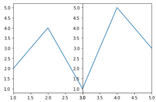
In this example code uses Matplotlib to create a figure with two subplots side by side. It plots the same data (`x` and `y`) in both subplots. The x-axis limits of the subplots are set differently, with the first subplot showing only the first three points of the data and the second subplot showing the last three points.
Python3 # import packages import matplotlib.pyplot as plt # create data x=[1,2,3,4,5] y=[2,4,1,5,3] # make subplots fig,(ax1,ax2) = plt.subplots(1, 2, sharey=False) # plot the subplots ax1.plot(x,y) ax2.plot(x,y) # set x limits ax1.set_xlim([ x[0],x[2]]) ax2.set_xlim([ x[2],x[4]]) # set width space to zero plt.subplots_adjust(wspace=0) # show the plots plt.show()
Output:
Parallel Coordinate Plot with Multiple Lines and Multiple Axes
In this example code uses the Matplotlib library to create a single row of 8 subplots, each displaying two line plots (y1 and y2) with different line styles ('g-.' and 'r--') for the corresponding x values. The x-axis limits for each subplot are set based on consecutive pairs of elements from the 'x' list. The subplots have zero width spacing between them, and the final plot is displayed.
Python3 # import packages import matplotlib.pyplot as plt # create data x=[1,2,3,4,5,6,7,8,9] y1=[2,4,1,5,3,4,2,5,2] y2=[3,4,3,5,2,6,4,2,3] # make subplots fig, (ax1,ax2,ax3,ax4,ax5,ax6,ax7,ax8) = plt.subplots(1, 8, sharey=False) ax = (ax1,ax2,ax3,ax4,ax5,ax6,ax7,ax8) # plot subplots and set xlimit for i in range(8): ax[i].plot(x,y1,'g-.',x,y2,'r--') ax[i].set_xlim([ x[i],x[i+1]]) # set width space to zero plt.subplots_adjust(wspace=0) # show plot plt.show()
Output :

Parallel Coordinate Plot Over Multi-dimensions Data
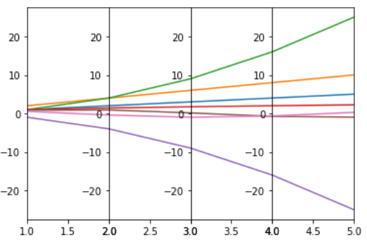
In this example code creates four subplots with different data series and sets individual x-axis limits for each subplot. The data consists of various functions applied to an array 'x'. The subplots display the different data series, and 'plt.subplots_adjust(wspace=0)' eliminates horizontal space between subplots.
Python3 # import packages import numpy as np import matplotlib.pyplot as plt # create data x = np.arange(1,6) data = [x,x*2,x*x,np.sqrt(x),-x*x,np.sin(x),np.cos(x)] print(data) # make subplots fig, (ax1,ax2,ax3,ax4) = plt.subplots(1, 4, sharey=False) ax = (ax1,ax2,ax3,ax4) # plot subplots and set xlimit for i in range(4): for j in range(len(data)): ax[i].plot(data[0],data[j]) ax[i].set_xlim([x[i],x[i+1]]) # set width space to zero plt.subplots_adjust(wspace=0) # show plot plt.show()
Output :
Parallel Coordinates Plot For Iris Dataset
In this example The code loads the Iris dataset, organizes it into a DataFrame, and assigns colors to each class. It then creates separate DataFrames for each class, plots parallel coordinates for each class using seaborn, and adds a legend to distinguish between classes in the plot. The resulting visualization displays the relationships between features in the Iris dataset for different classes.
Python3 import pandas as pd import matplotlib.pyplot as plt import seaborn as sns from sklearn.datasets import load_iris # Load Iris dataset as an example iris = load_iris() iris_df = pd.DataFrame(iris.data, columns=iris.feature_names) iris_df['target'] = iris.target iris_class_names = iris.target_names # Create a list of colors for each class colors = sns.color_palette('husl', n_colors=len(iris_class_names)) # Create a list of dataframes, each containing data for one class class_dfs = [iris_df[iris_df['target'] == i].drop('target', axis=1) for i in range(len(iris_class_names))] # Plot Parallel Coordinates for each class plt.figure(figsize=(12, 8)) for i, class_df in enumerate(class_dfs): sns.lineplot(data=class_df, palette=[colors[i]]) plt.title('Parallel Coordinates Plot - Iris Dataset') plt.xlabel('Features') plt.ylabel('Feature Values') # Add legend plt.legend(iris_class_names, loc='upper right') plt.show() Output :

Parallel Coordinates Using plotly.graph_objects
In this example code uses Plotly to create an interactive parallel coordinates plot. It generates example data with a linear relationship, creates a parallel coordinates plot with 'X-axis' and 'Y-axis' dimensions, adds a scatter plot for data points, and updates the layout with titles. The resulting visualization shows a dynamic representation of the data's multivariate relationships.
Python3 import matplotlib.pyplot as plt import numpy as np # Generate example data np.random.seed(42) x = np.random.rand(50) y = 2 * x + 1 + 0.1 * np.random.randn(50) # Linear relationship with some noise # Create a scatter plot plt.figure(figsize=(8, 6)) plt.scatter(x, y, label='Data points', color='blue', marker='o') # Add labels and title plt.xlabel('X-axis') plt.ylabel('Y-axis') plt.title('Scatter Plot Example') # Add a regression line plt.plot(x, 2 * x + 1, color='red', linestyle='--', label='True Regression Line') # Display the legend plt.legend() # Show the plot plt.grid(True) plt.show() Output :

Similar Reads
Customizing Styles in Matplotlib Here, we'll delve into the fundamentals of Matplotlib, exploring its various classes and functionalities to help you unleash the full potential of your data visualization projects. From basic plotting techniques to advanced customization options, this guide will equip you with the knowledge needed t
12 min read
Grids in Matplotlib Grids are made up of intersecting straight (vertical, horizontal, and angular) or curved lines used to structure our content. Matplotlib helps us to draw plain graphs but it is sometimes necessary to use grids for better understanding and get a reference for our data points. Thus, Matplotlib provide
4 min read
Plot Multiple lines in Matplotlib In this article, we will learn how to plot multiple lines using matplotlib in Python. Let's discuss some concepts:Matplotlib: Matplotlib is an amazing visualization library in Python for 2D plots of arrays. Matplotlib is a multi-platform data visualization library built on NumPy arrays and designed
6 min read
Line chart in Matplotlib - Python Matplotlib is a data visualization library in Python. The pyplot, a sublibrary of Matplotlib, is a collection of functions that helps in creating a variety of charts. Line charts are used to represent the relation between two data X and Y on a different axis. In this article, we will learn about lin
6 min read
Matplotlib.pyplot.hlines() in Python Matplotlib is an amazing visualization library in Python for 2D plots of arrays. Matplotlib is a multi-platform data visualization library built on NumPy arrays and designed to work with the broader SciPy stack. Matplotlib.pyplot.hlines() The Matplotlib.pyplot.hlines() is used to draw horizontal lin
2 min read