Pandas DataFrame hist() Method | Create Histogram in Pandas
Last Updated : 01 Feb, 2024
A histogram is a graphical representation of the numerical data. Sometimes you'll want to share data insights with someone, and using graphical representations has become the industry standard.
Pandas.DataFrame.hist() function plots the histogram of a given Data frame.
It is useful in understanding the distribution of numeric variables. This function splits up the values into the numeric variables.
When Pandas function DataFrame.hist() is used, it automatically calls the function matplotlib.pyplot.hist() on each series in the Pandas DataFrame. As a result, we obtain one histogram per column.
Syntax
Syntax: DataFrame.hist(data, column=None, by=None, grid=True, xlabelsize=None, xrot=None, ylabelsize=None, yrot=None, ax=None, sharex=False, sharey=False, figsize=None, layout=None, bins=10, backend=None, legend=False, **kwargs)
Parameters:
- data: DataFrame
- column: str or sequence
- xlabelsize: int, default None
- ylabelsize: int, default None
- ax: Matplotlib axes object, default None
- **kwargs All other plotting keyword arguments to be passed to matplotlib.pyplot.hist().
Return: matplotlib.AxesSubplot or numpy.ndarray
Examples
Below are the examples of Pandas DataFrame.hist() functions that we can use to plot histograms with Pandas in Python:
Example 1: Creating Histograms of 2 Columns of Pandas DataFrame
Sometimes we need to plot Histograms of columns of DataFrame to analyze them more deeply. In that case, the DataFrame.hist() function helps a lot. Using this function, we can plot histograms of as many columns as we want.
In the below example, we plot histograms of columns 'Length' and 'Breadth' using the DataFrame.hist() function.
Python3 # Importing pandas library import pandas as pd # Creating a Data frame values = pd.DataFrame({ 'Length': [2.7, 8.7, 3.4, 2.4, 1.9], 'Breadth': [4.24, 2.67, 7.6, 7.1, 4.9] }) # Creating Histograms of columns 'Length' # and 'Breadth' using Dataframe.hist() # function hist = values.hist(bins=5) Output

Example 2: Plot Histogram With Pandas of 3 Columns
In the below example, we plot histograms of columns 'Length', 'Breadth', and 'Height' using DataFrame.hist() function.
In this example, histograms for the columns 'Length', 'Breadth', and 'Height' are generated from a DataFrame named 'values' using the DataFrame.hist() function with 12 bins each.
Python3 # Importing pandas library import pandas as pd # Creating a Data frame values = pd.DataFrame({ 'Length': [2.7, 8.7, 3.4, 2.4, 1.9], 'Breadth': [4.24, 2.67, 7.6, 7.1, 4.9], 'Height': [5.8, 5.5, 7.8, 10.88, 0.1]}) # Creating Histograms of columns 'Length', # 'Breadth' and 'Height' using Dataframe.hist() # function hist = values.hist(bins=12) Output

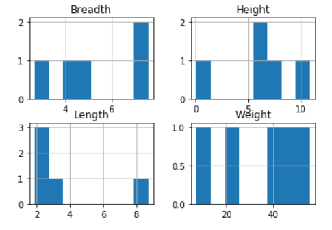
Example 3: Plot Histogram of 4 columns Using Pandas DataFrame
In the below example, we plot histograms of columns 'Length', 'Breadth', 'Height', and 'Weight' using DataFrame.hist() function.
Python3 # Importing pandas library import pandas as pd # Creating a Data frame values = pd.DataFrame({ 'Length': [2.7, 8.7, 3.4, 2.4, 1.9], 'Breadth': [4.24, 2.67, 7.6, 7.1, 4.9], 'Height': [5.8, 5.5, 7.8, 10.88, 0.1], 'Weight': [20, 40.8, 55.8, 7.2, 48] }) # Creating Histograms of columns 'Length', # 'Breadth', 'Height' and 'Weight' # using Dataframe.hist() function hist = values.hist(bins=8) Output
Example 4: Plot Histogram With Pandas For Specific Column
In this example, a histogram is created for the 'Length' column of a DataFrame named 'values' using Matplotlib and Pandas. The histogram is customized with a title, x-axis label ('Length'), and y-axis label ('Frequency'), and then displayed using plt.show().
Python3 # Importing required libraries import pandas as pd import matplotlib.pyplot as plt # Creating a Data frame values = pd.DataFrame({ 'Length': [2.7, 8.7, 3.4, 2.4, 1.9], 'Breadth': [4.24, 2.67, 7.6, 7.1, 4.9], 'Height': [5.8, 5.5, 7.8, 10.88, 0.1], 'Weight': [20, 40.8, 55.8, 7.2, 48] }) # Plotting Histogram for the 'Length' column hist = values['Length'].hist(bins=8) # Adding title and labels plt.title('Histogram for Length Column') plt.xlabel('Length') plt.ylabel('Frequency') # Display the histogram plt.show() Output

Also Check:
Conclusion
Using graphs to graphically represent the findings is a very important step in data analysis. A histogram is used to represent the spread of your data.
In this tutorial, we covered how to use the in-built Pandas function DataFrame.hist() to plot a histogram in Python. We have explained the DataFrame.hist() function in easy words with examples. You can practice and experiment with the function to gain confidence using it.
Similar Reads
How to Create a Histogram from Pandas DataFrame? A histogram is a graph that displays the frequency of values in a metric variable's intervals. These intervals are referred to as "bins," and they are all the same width. We can create a histogram from the panda's data frame using the df.hist() function. Syntax: DataFrame.hist(column=None, by=None,
2 min read
Create empty dataframe in Pandas The Pandas Dataframe is a structure that has data in the 2D format and labels with it. DataFrames are widely used in data science, machine learning, and other such places. DataFrames are the same as SQL tables or Excel sheets but these are faster in use.Empty DataFrame could be created with the help
1 min read
How to Create Pie Chart from Pandas DataFrame? A pie chart is a circular statistical graphic divided into slices to illustrate numerical proportions. Each slice represents a category's contribution to the whole, typically expressed as a percentage of 100%. Pie charts are widely used in research, engineering, business analytics and data visualiza
4 min read
Pandas DataFrame describe() Method The describe() method in Pandas generates descriptive statistics of DataFrame columns which provides key metrics like mean, standard deviation, percentiles and more. It works with numeric data by default but can also handle categorical data which offers insights like the most frequent value and the
4 min read
How to Create Boxplot from Pandas DataFrame? A box plot (or whisker plot) is a statistical graph that shows the minimum, first quartile (Q1), median, third quartile (Q3) and maximum values of a dataset. It helps analyze data spread, skewness and outliers and is widely used in data visualization. In this article you'll learn how to create box p
2 min read