We have a variety of data visualization approaches in machine learning which includes line charts, bar charts etc. but deciding on which color to choose for better visualization is need to be considered. In this article let's understand the requirement of colors for correct data visualization.
Understanding Color Palette
Understanding a color palette involves understanding how colors are chosen and mixed to produce a consistent and visually attractive scheme for a variety of purposes including design, art, fashion, and branding. The main elements of a color palette:
- Primary colors: In classical color theory, the basic colors are RGB( red, blue, and yellow,) which may be blended to produce new hues used in digital design including screens and displays.
- Secondary colors: Primary colors are mixed together to create this. For example, blending blue and yellow results in green.
- Tertiary Colors: Blue-green and red-orange are examples of main and secondary color combinations.
- Neutral colors: Include black, white, greys, and sometimes browns and beiges. These colors may be used to tone down a palette or as a backdrop for more intense colors.
Components and Properties of Colors
Colors contain a variety of components and qualities that determine how they seem and interact with one another. Understanding these components and qualities is critical for developing successful color palettes and designs.
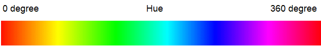
1. Hue: It is one of the property which is related with its position on the color wheel(generally, we plot hue on the circumference of the wheel). There is no color hierarchy instead its mainly differentiated by its characteristics. For example, We are designing a room and we need various colors for decorating the room. Let us use shades for hues of red and orange to create a warm, energetic feel and could use shades for hues of blue for cooling atmosphere. This denotes that each and every characteristics for creating the good vibe of the space. This is generally used to make attractive to users by adding visual interests on data.
2. Saturation: The intensity of the color is defined by 'saturation' . In color wheel, its located on the radius of the wheel. Apart from this saturation has a scale of 0-100% where, 0% depicts the color is dark and less saturated which therefore is approaching towards 'gray' color. On the other hand 100% denotes the pure bold version of that color. This is often used to add energy on the data.

3. Brightness/Lightness : The term 'brightness' defines the quantity of light where an object reflects back from another. In the color wheel, when we add 'white' to each color it automatically increase the brightness and reaches up to 100%. This process is known as 'tinting'. On the other hand if we add 'black' to each color it automatically decrease the brightness and reaches up to 0%. This process is known as 'shading'. This is generally used for those data which are required by visually aware or younger users.

Temperature can be defined as a presentation of color instead of saying it as a property. Colors are often correlated with temperature in ways related to the psychological and emotional reactions they elicit, as well as their location on the color spectrum. This is further divided into two types: 'warm' and 'cold' ones.
Warm colors: Warm colors are ones that are often associated with warmth. Examples include: Red, Orange, Yellow. They are often seen as:
- Emotional Impact: These colors often evoke sentiments of warmth, comfort, energy, and enthusiasm.
- Warm colors helps increasing emotions of pleasure, comfort, and excitement. They may also indicate danger or urgency (for example, red for stop signs).
Cool colors: Cool colors are connected with cooler temperatures and include: Blue, Green, Purple. They are often seen as:
- Emotional Impact: These colors are often associated with tranquility, relaxation, and serenity.
- Cool colors have a calming and peaceful effect on the mind. They are often utilized in places designed for leisure and peace.
 Color Temperatures
How to select color temperature for better visualization?
In the presentation if analysts are using one warm and one cool color then the warm ones will pop out and pretend to be more superior.
- It's advisable to use all cool or all warm if the colors used are located near each other in the color wheel.
- On the other hand, we should use one cool and one warm or several cools and several warms if the colors are located far from each other.
Types of Color Palettes
There are three different types of color palette and it all depends upon the role of colors.
1. Qualitative Color Palette
- These palettes are used to represent the unordered types of data in the presentation.
- We apply categorical palette when we have to differentiate between discrete categories of the data.
- They are formed with the help of several different hues.
- We use these palettes for scatter plots and pie charts.
- This palette must be limited to 10 unique colors which consists of little amount of hue and saturation.
- Example, We use different colors to represent some common status in project management task. Like, 'yellow' is used for in-progress, 'green' is used for completed and 'red' is used for overdue tasks.

2. Sequential Color Palette
- We use sequential color palette for continuous data or ordered data.
- We will show this data with the range of light to dark of a single color.
- This is made up of single hue.
- We use these patterns for heatmaps, gradients etc.
- In this palette, light shades are used to denote lower values where darker shades are for higher values.
- Example, Let's see the shades of grass, the lighter part will denote younger grass and the darker shades will show older or denser grass.

3. Diverging Color Pallette
- It is basically used for comparing relationships and highlight the differences for compared data points.
- This type of palette is used when we have to visualize data with a central value.
- These use two contrasting hues where one represents those values which are above the central point and the other denotes the values below it.
- Example: The shades of red denotes the warmer temperature, shades of blue will represent cooler temperature and white/gray will show the average temperature at the midpoint.

Popular Color Palettes
Some of the popular color palettes which are widely used by analysts for their visualization are:
1. Virdis: It is a range of color which consists of deep blue to vibrant yellow for continuous data.

2. Spectral: It comes under diverging color palette where we can easily flow from one color to another over the range of mid tone shades.

Selecting Primary Color
After creating the palette it's time to choose a key color. This key color can be of various types like primary brand color usage of the same color that was used in the previous presentation. The main aim of this key color is to depict data points in the presentation to catch the attention of the audience. It is used to illustrate the relationship between the data points and the rest of the data and the count of colors we are going to use.
We all know that color has three properties: hue, saturation, and lightness or brightness. To adjust a new color for the palette we can change only one property instead of changing three of them. Therefore, whatever property of color will change depends upon the types of data:
- For categorical and discrete we should change the hue.
- For continuous we should change the saturation or the lightness or brightness.
Color Palettes for Comparing Objects
1. Pallettes Used to Compare Two Objects
Let's consider a scenario of comparing two things, and it's mentioned that one of them is more superior than the other. At this time we will use our key color for the superior ones and gray for the lesser ones.
On the other hand if we have two distinct things and want to use two different colors we will focus on the concept of color harmony. We have three types of color harmony:
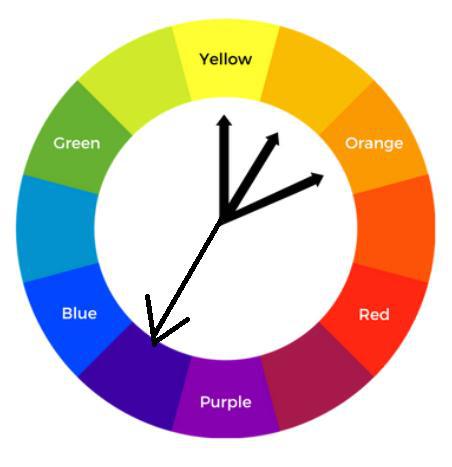
1.1. Analogous Harmony
It is generally used for comparing two series without an evaluation of value. This process consists of selecting our key color and then searching for its one-step neighbor colors on the color wheel.
 Analogous Harmony
1.2 Complementary Harmony
As we know, the key color on the color wheel will support those colors that are opposite to it more than the near colors. From this, we get to know that complementary colors are the direct opposite and serve the strongest contrast. This process consists of selecting your key color and representing it as a positive while its complementary color can be treated as a negative variation. It's always advisable not to use your brand's color as negative, even if that color is commonly used.
 Complementary Harmony
1.3 Near Complementary
It is used for comparing two things with one as its primary goal. When the opposite colors come together it shows a strong contrast among them by ignoring the way they are related to each other. Here comes the near complement which is 33% of the path rather than 50% of the color wheel. Like if the key color is at 1 o'clock, then near complementary will be at 5 o'clock or 9 o'clock on the wheel. Generally the key color is warm and the complementary color is cool; if it's not like this we should decrease the saturation or lightness level of the secondary color to make it perfect.
 Near Complementary Harmony
2. Palettes Used to Compare Three Objects
As we have seen the comparison of two objects goes smoothly but the comparison of three objects is a little tough. But we can do it with the help of two types of color harmony which support tricolor representation:
2.1 Analogous or Triadic
It is generally used for comparing three series without an evaluation of value. This process consists of selecting a key color and then the remaining two colors which are evenly spaced with each other around the color wheel. Or we can say the three colors are equidistant on the wheel to maintain proper balance. It's advisable to use one color as the primary color and the other two as features to make it readable for the audience.
 Triadic consists of three equidistant colors on the wheel.
2.2 Split Complementary
This process consists of a key color alone on one side, and the other two colors are on the opposite side in such a way that they should be one step away from the exact complement of the key color. This palette also implies that two objects in a series are related to each other but different from the series that has the key color.
 Choose any color with two colors on the either side of its complementary color.
3. Palettes Used to Compare Four Objects
It's very rare to observe four different colors in the comparison of objects in a presentation since it's very hard for the audience to focus on the concept. Though it's rare we follow some color harmony to make it easy for the audience which are:
3.1. Analogous Complementary
It is used for one main series and its three components. This is the process of selecting the key color and not only its direct complement but also its split complement color to maintain proper harmony. This shows the major difference between complementary and key colors. Here the series that tends to pop out is the average one and the important one is the one that we are thinking about.
 Analogous Complementary Color Harmony
3. 2. Double Complementary
It is the case when we have four series so we can think of combining two groups of two series. In other words we can say one pair is dominant and two pairs are related. It is the process of selecting the key color first and then choosing its two analogues with their exact complement of colors. To maintain harmony it keeps its key color the analogs either cool or warm and its complements in the opposite color.
 Double Complementary Color Harmony
3. 3 Square or Rectangular
It is used for differentiating four series of equal importance. For square harmony we start from the key color and stop at every third step around the clock. On the other hand for rectangular harmony we select a key color that is near analog two steps away on the clock along with its complement. However it's said that square follows equal footing and rectangular follows two pairs of two series.
.jpg)
Color Palettes for Quantitative Data
It's observed that to show quantitative data with its specific colors, it should maintain its harmony with changes in saturation or lightness levels. The two types of color harmony are:
- Sequential Color Ramp: It is used to show the change in the values ranging from zero to the maximum count. Here we use a monochromatic or single-hued palette. It is the process where the lower value is represented by a color that matches the background of the chart and the highest color matches the key color by having a 50% lightness and a 100% saturation. We have smooth as well as stepped types of palette for more precision and attention to the audience.
- Diverging Color Ramp: It is used to show changes in value with a range and its relevant midpoint. Here we use a dichromatic or two-hued palette. It is the process where we assign the key color as positive the complement as negative and use a neutral gray color for the midpoint (in the case when tails are stitched together).
 Color Palettes for quantitative Data
Advantages of Color Theory - Selecting Right Color for Visualization
- Convey Emotions: Emotions are directly connected with colors. Different color symbolize different emotions whether it is sad, happy, optimistic, afraid, anxious or urgency. Generally, darker colors like red, orange are used by analysts for showing negative emotions and lighter colors like yellow, light blue used for showing positive emotions in their analysis.
- Accessible for all: This is one of the most demanding benefit of color theory. Everyone around the world can use this feature to improve their presentations. This will also help people to connect with each other across the nation.
- Providing Clarity: Clarity is one of the major factor to enhance your presentations. To make a content readable analysts have to use visuals like slides bars with different colors to communicate their ideas with the users. Apart from this the content should be precise well structured and relevant to the topic.
- Consistency: Color theory acts as a crucial part for branding as well as for data representations. The consistency in color will increase the brand recognition professionalism and trust among all the viewers for that particular brand.
Importance of Background Colors
Before the selection of background color analysts should maintain the contrast and clarity of the data in the content. To make it readable one should use appropriate colors for presenting their data more effectively. Like we can use light blue color for inducing calmness dark gray for sophistication. Not only it will support brand identification but also it will convey specific emotions for the data to be used.
While it's understandable that generally white background offers high contrast and gray/ beige provides softer alternatives to improve its effectiveness. Therefore we can conclude that select the background color in such a way that it should be readable and understandable to users.
Best Practices for Selecting Right Color
- Resist Overuse: It's always preferred to use neutral colors like gray color for charts and mention the data points on them with some bold colors. To use two or three colors is much more suited as compared to the usage of multicolor in your presentation, which will help users to avoid confusions.
- Correct Color Scheme according to dataset: Before selecting the color palette always see the type of dataset and then prefer your palette according to it. We have three types of color palette which includes sequential, categorical and diverging for different patterns of data since every data and its color has the own significance.
- Observe Color Conventions: Around the world, colors has their own importance with different meaning. For example in some places 'red' is used for danger while in some places it's used for excitement and love. From this we can say that one color has different meanings.
- Avoid Color Blindness: We should always observe whether the user has any color blindness or not. According to that we should use color to make it easy to read for them also. Like if a person has red-green blindness so we should use some different combination of color for their convenience.
- Black and White: We should always visualize our data firstly in black and white color and then should try for other color techniques. It comes into action when the deadline of presentation is near and we are not happy with our color technique, then at least we can submit black and white as an usable version.
In conclusion under this topic, we have covered about what is color palette, its usage, benefits, selecting key color, how color is related to temperature, palettes for showing quantitative data, palettes used for comparison of two to four objects and importance of palette in data visualization. For more, refer to: