How to Create a Custom Intro Slider of an Android App?
Last Updated : 04 May, 2025
Intro Slider in many apps is mostly used to educate the users about the app, the features of the app, and the services that our app will provide to us. In this article, we will take a look at the implementation of Custom Intro Slider in our app.
What we are going to build in this Article?
We will be building a simple application in which we will be displaying an intro slider in which we will show slider in our app. This slider contains a simple image and two TextView. Note that we are going to implement this project using the Java and Kotlin language.
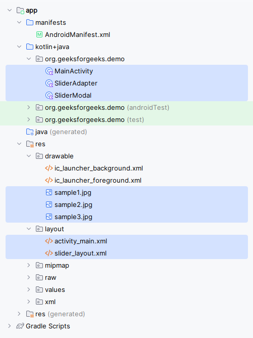
File Structure for the Application
Below is the File Structure of the Application:
Step by Step Implementation
Step 1: Create a New Project
To create a new project in Android Studio please refer to How to Create/Start a New Project in Android Studio.
Step 2: Adding the dependency for Picasso in your build.gradle file
As we will be loading all our images from online sources so we will be using Glide for loading images from URLs inside our application. So for using the images from the URL we have to add the below dependency in our build.gradle.kts (Module :app) file.
dependencies { ... implementation("com.github.bumptech.glide:glide:4.16.0") }Step 3: Working with the activity_main.xml file
Navigate to the app > res > layout > activity_main.xml and add the below code to that file.
Note: activity_main.xml is the XML file for the main activity window.
activity_main.xml:
activity_main.xml <?xml version="1.0" encoding="utf-8"?> <androidx.constraintlayout.widget.ConstraintLayout xmlns:android="http://schemas.android.com/apk/res/android" xmlns:app="http://schemas.android.com/apk/res-auto" xmlns:tools="http://schemas.android.com/tools" android:layout_width="match_parent" android:layout_height="match_parent" tools:context=".MainActivity"> <!--view pager for displaying our slides--> <androidx.viewpager.widget.ViewPager android:id="@+id/idViewPager" android:layout_width="match_parent" android:layout_height="match_parent" app:layout_constraintBottom_toBottomOf="parent" app:layout_constraintEnd_toEndOf="parent" app:layout_constraintStart_toStartOf="parent" app:layout_constraintTop_toTopOf="parent" /> <LinearLayout android:layout_width="match_parent" android:layout_height="wrap_content" android:gravity="center" android:orientation="vertical" app:layout_constraintBottom_toBottomOf="parent" app:layout_constraintEnd_toEndOf="parent" app:layout_constraintStart_toStartOf="parent"> <!--adding linear layout for creating dots view--> <LinearLayout android:id="@+id/dotsLayout" android:layout_width="wrap_content" android:layout_height="wrap_content" android:layout_gravity="center" android:gravity="center" android:orientation="horizontal" /> <!--button for skipping our intro slider--> <Button android:id="@+id/getStartedButton" android:layout_width="match_parent" android:layout_height="wrap_content" android:layout_margin="32dp" android:text="Get Started" android:background="@color/colorPrimary" android:textColor="@color/white" /> </LinearLayout> </androidx.constraintlayout.widget.ConstraintLayout>
Step 4: Creating a layout file for our Slider item
Now we will create an item that we will be displaying in our slider. So for creating a new layout navigate to the app > res > layout > Right-click on it > Click on New > layout resource file and name it as slider_layout and add below code to it.
Note: slider_layout.xml is the fragment used for the sliders.
slider_layout.xml:
slider_layout.xml <?xml version="1.0" encoding="utf-8"?> <LinearLayout xmlns:android="http://schemas.android.com/apk/res/android" android:layout_width="match_parent" android:layout_height="match_parent" android:orientation="vertical" android:gravity="center"> <!--text view for displaying our title--> <TextView android:id="@+id/titleTextView" android:layout_width="wrap_content" android:layout_height="wrap_content" android:padding="10dp" android:text="Slide 1" android:textColor="@color/black" android:textSize="24sp" android:textStyle="bold" /> <!--Image view for displaying our slider image--> <ImageView android:id="@+id/imageView" android:layout_width="match_parent" android:layout_height="wrap_content" android:layout_margin="50dp" android:src="@mipmap/ic_launcher" /> <!--text view for displaying our slider description--> <TextView android:id="@+id/descriptionTextView" android:layout_width="wrap_content" android:layout_height="wrap_content" android:text="Slide Description" android:textStyle="italic" android:textColor="@color/black" /> </LinearLayout>
Step 5: Creating a Modal class for storing all the data for Slider items
For creating a new Modal class navigate to the app > java > your app’s package name > Right-click on it and click on New > Java/Kotlin class and name it as SliderModal.
SliderModal.java package org.geeksforgeeks.demo; public class SliderModal { private String title; private String heading; private int imgUrl; public SliderModal(String title, String heading, int imgUrl) { this.title = title; this.heading = heading; this.imgUrl = imgUrl; } public String getTitle() { return title; } public String getHeading() { return heading; } public int getImgUrl() { return imgUrl; } } package org.geeksforgeeks.demo data class SliderModal( val title: String, val heading: String, val imgUrl: Int )
Step 6: Create an Adapter class for setting data to each view
For creating a new Adapter class navigate to the app > java > your app’s package name > Right-click on it > New Java/Kotlin class and name it as SliderAdapter and add the below code to it.
SliderAdapter.java package org.geeksforgeeks.demo; import android.content.Context; import android.view.LayoutInflater; import android.view.View; import android.view.ViewGroup; import android.widget.ImageView; import android.widget.TextView; import androidx.viewpager.widget.PagerAdapter; import com.bumptech.glide.Glide; import java.util.ArrayList; public class SliderAdapter extends PagerAdapter { private Context context; private ArrayList<SliderModal> sliderModalArrayList; // LayoutInflater to inflate custom layout private LayoutInflater layoutInflater; public SliderAdapter(Context context, ArrayList<SliderModal> sliderModalArrayList) { this.context = context; this.sliderModalArrayList = sliderModalArrayList; } // Returns the total number of items @Override public int getCount() { return sliderModalArrayList.size(); } // Checks whether a page View is associated with a specific key object @Override public boolean isViewFromObject(View view, Object object) { return view == object; } // Instantiates and returns a page View object @Override public Object instantiateItem(ViewGroup container, int position) { layoutInflater = (LayoutInflater) context.getSystemService(Context.LAYOUT_INFLATER_SERVICE); View view = layoutInflater.inflate(R.layout.slider_layout, container, false); // Initialize views ImageView imageView = view.findViewById(R.id.imageView); TextView titleTV = view.findViewById(R.id.titleTextView); TextView headingTV = view.findViewById(R.id.descriptionTextView); // Set data to views SliderModal modal = sliderModalArrayList.get(position); titleTV.setText(modal.getTitle()); headingTV.setText(modal.getHeading()); Glide.with(context).load(modal.getImgUrl()).into(imageView); // Add the view to container container.addView(view); return view; } // Removes a page View from the container @Override public void destroyItem(ViewGroup container, int position, Object object) { container.removeView((View) object); } } package org.geeksforgeeks.demo import android.content.Context import android.view.LayoutInflater import android.view.View import android.view.ViewGroup import android.widget.ImageView import android.widget.TextView import androidx.viewpager.widget.PagerAdapter import com.bumptech.glide.Glide class SliderAdapter( private var context: Context, private var sliderModalArrayList: ArrayList<SliderModal> ) : PagerAdapter() { // LayoutInflater to inflate custom layout private lateinit var layoutInflater: LayoutInflater // Returns the total number of items override fun getCount(): Int { return sliderModalArrayList.size } // Checks whether a page View is associated with a specific key object override fun isViewFromObject(view: View, `object`: Any): Boolean { return view === `object` } // Instantiates and returns a page View object override fun instantiateItem(container: ViewGroup, position: Int): Any { layoutInflater = context.getSystemService(Context.LAYOUT_INFLATER_SERVICE) as LayoutInflater val view: View = layoutInflater.inflate(R.layout.slider_layout, container, false) // Initialize views val imageView = view.findViewById<ImageView>(R.id.imageView) val titleTV = view.findViewById<TextView>(R.id.titleTextView) val headingTV = view.findViewById<TextView>(R.id.descriptionTextView) // Set data to views val modal: SliderModal = sliderModalArrayList[position] titleTV.text = modal.title headingTV.text = modal.heading Glide.with(context).load(modal.imgUrl).into(imageView) // Add the view to container container.addView(view) return view } // Removes a page View from the container override fun destroyItem(container: ViewGroup, position: Int, `object`: Any) { container.removeView(`object` as View) } }
Step 7: Working with theMainActivity file
Go to the MainActivity file and refer to the following code. Below is the code for the MainActivity file. Comments are added inside the code to understand the code in more detail.
MainActivity.java package org.geeksforgeeks.demo; import android.os.Bundle; import android.text.Html; import android.widget.LinearLayout; import android.widget.TextView; import androidx.activity.ComponentActivity; import androidx.activity.enableEdgeToEdge; import androidx.appcompat.app.AppCompatActivity; import androidx.core.content.ContextCompat; import androidx.viewpager.widget.ViewPager; import androidx.viewpager.widget.ViewPager.OnPageChangeListener; import java.util.ArrayList; public class MainActivity extends AppCompatActivity { private ViewPager viewPager; private LinearLayout dotsLL; private SliderAdapter adapter; private ArrayList<SliderModal> sliderModalArrayList; private TextView[] dots; private int size = 0; @Override protected void onCreate(Bundle savedInstanceState) { super.onCreate(savedInstanceState); enableEdgeToEdge(); setContentView(R.layout.activity_main); // Initialize views viewPager = findViewById(R.id.idViewPager); dotsLL = findViewById(R.id.dotsLayout); // Create and populate slider items sliderModalArrayList = new ArrayList<>(); sliderModalArrayList.add(new SliderModal("Slide 1", "Slide 1 heading", R.drawable.sample1)); sliderModalArrayList.add(new SliderModal("Slide 2", "Slide 2 heading", R.drawable.sample2)); sliderModalArrayList.add(new SliderModal("Slide 3", "Slide 3 heading", R.drawable.sample3)); // Set up adapter with slider items adapter = new SliderAdapter(this, sliderModalArrayList); viewPager.setAdapter(adapter); // Get the total number of slides size = sliderModalArrayList.size(); // Add initial dot indicators addDots(size, 0); // Set page change listener viewPager.addOnPageChangeListener(viewListener); } // Method to add and update dot indicators private void addDots(int size, int pos) { dots = new TextView[size]; dotsLL.removeAllViews(); for (int i = 0; i < size; i++) { dots[i] = new TextView(this); dots[i].setText(Html.fromHtml("•")); dots[i].setTextSize(35f); dots[i].setTextColor(ContextCompat.getColor(this, R.color.black)); dotsLL.addView(dots[i]); } // Highlight selected dot if (dots.length > 0) { dots[pos].setTextColor(ContextCompat.getColor(this, R.color.colorPrimary)); dots[pos].setTextSize(45f); } } // Page change listener to update dots on slide change private final OnPageChangeListener viewListener = new OnPageChangeListener() { @Override public void onPageScrolled(int position, float positionOffset, int positionOffsetPixels) {} @Override public void onPageSelected(int position) { addDots(size, position); } @Override public void onPageScrollStateChanged(int state) {} }; } package org.geeksforgeeks.demo import android.os.Bundle import android.text.Html import android.widget.LinearLayout import android.widget.TextView import androidx.activity.enableEdgeToEdge import androidx.appcompat.app.AppCompatActivity import androidx.core.content.ContextCompat import androidx.viewpager.widget.ViewPager import androidx.viewpager.widget.ViewPager.OnPageChangeListener class MainActivity : AppCompatActivity() { private lateinit var viewPager: ViewPager private lateinit var dotsLL: LinearLayout private lateinit var adapter: SliderAdapter private lateinit var sliderModalArrayList: ArrayList<SliderModal> private lateinit var dots: Array<TextView?> private var size: Int = 0 override fun onCreate(savedInstanceState: Bundle?) { super.onCreate(savedInstanceState) enableEdgeToEdge() setContentView(R.layout.activity_main) // Initialize views viewPager = findViewById(R.id.idViewPager) dotsLL = findViewById(R.id.dotsLayout) // Create and populate slider items sliderModalArrayList = ArrayList() sliderModalArrayList.add(SliderModal("Slide 1", "Slide 1 heading", R.drawable.sample1)) sliderModalArrayList.add(SliderModal("Slide 2", "Slide 2 heading", R.drawable.sample2)) sliderModalArrayList.add(SliderModal("Slide 3", "Slide 3 heading", R.drawable.sample3)) // Set up adapter with slider items adapter = SliderAdapter(this@MainActivity, sliderModalArrayList) viewPager.adapter = adapter // Get the total number of slides size = sliderModalArrayList.size // Add initial dot indicators addDots(size, 0) // Set page change listener viewPager.addOnPageChangeListener(viewListener) } // Method to add and update dot indicators private fun addDots(size: Int, pos: Int) { dots = arrayOfNulls(size) dotsLL.removeAllViews() for (i in 0 until size) { dots[i] = TextView(this).apply { text = Html.fromHtml("•") textSize = 35f setTextColor(ContextCompat.getColor(this@MainActivity, R.color.black)) } dotsLL.addView(dots[i]) } // Highlight selected dot if (dots.isNotEmpty()) { dots[pos]?.apply { setTextColor(ContextCompat.getColor(this@MainActivity, R.color.colorPrimary)) textSize = 45f } } } // Page change listener to update dots on slide change private var viewListener: OnPageChangeListener = object : OnPageChangeListener { override fun onPageScrolled(position: Int, positionOffset: Float, positionOffsetPixels: Int) {} override fun onPageSelected(position: Int) { addDots(size, position) } override fun onPageScrollStateChanged(state: Int) {} } } Note : To access the full Slider in an Android App check this repository: Click Here to Access the Whole Project
Output:
Similar Reads
How to Create a Basic Intro Slider of an Android App?
When we download any app and use that app for the very first time. Then we will get to see the intro slider inside our app. With the help of this slider, we educate our users on how they can use that app and it tells in detail about the app. In this article, we will take a look at the implementation
4 min read
Create Custom Intro Slider of an Android App with Kotlin
IntroSlider is seen in many android applications to display the introduction of the different screens within our application. This intro slider will display information about different features within the android application. In this article, we will take a look at How to Create a Custom Intro Slide
8 min read
How to Create a Dice Roller App in Android?
A dice roller application is a simple application that generates a random number between 1 and a specified maximum number, simulating the roll of a dice. The application is typically used by gamers or anyone who needs to roll a die but doesn't have physical dice available. To create the app, you nee
2 min read
How to Create a Custom Stepper Form in Android?
In this article, we are going to implement the multi-step form in modern Android apps. The basic working of that is when User Clicks on the Next Button then a new form comes with different input fields. Also, we have added a step indicator feature to track the user's progress through the steps. Also
5 min read
How to Create a Basic Widget of an Android App?
Widgets are the micro-version of the application that consists of some functionality of the application that is displayed only on the Home Screens or the Lock Screen. For example, we see Weather, Time, and Google Search Bars on the Home Screen, and FaceLock, and FingerprintLock on the Lock Screen, w
5 min read
How to Create a Unlock Slide-Bar in Android?
A SeekBar is an extension of ProgressBar that adds a draggable thumb. The user can touch the thumb and drag left or right to set the current progress level or use the arrow keys. SeekBar is a useful user interface element in Android that allows the selection of integer values using a natural user in
5 min read
How to Customise MDC Sliders in Android?
In the article of Material Design Components Sliders in Android, it's been discussed how to implement the Material Design Component sliders in android and also handled the click listener for all types of sliders. In this article, it's been discussed how to customize the Material Design Component sli
5 min read
How to add Custom Spinner in Android?
Spinner is a widget that is used to select an item from a list of items. When the user tap on a spinner a drop-down menu is visible to the user. In this article, we will learn how to add custom spinner in the app. Steps of Implementing Custom SpinnerStep 1: Create a new layout for each item in Spinn
5 min read
How to Create a Wallpaper App in Android Studio?
Almost all Android devices are having a wallpaper set on their home screen. For setting this wallpaper to the screen many Android devices provides a Wallpaper Application where we can browse different types of wallpapers based on various categories. In this article we will look at, building a simila
15+ min read
How to Create Shine Effect in Android?
Shine Effect is used to give an ImageView, Button, or a View a better animation look. It is very easy to implement. A sample GIF is given below to get an idea about what we are going to do in this article. Note that we are going to implement this project using the Kotlin language.  Step by Step Imp
3 min read