Data Visulization Techniques for Qualitative Research
Last Updated : 17 May, 2024
Data visualization techniques play a crucial role in qualitative research by helping researchers explore and communicate patterns, relationships, and insights within their data. Here are some effective techniques commonly used in qualitative research. Qualitative data, conveyed through narratives, descriptions, and quotations, differs significantly from quantitative numerical data, necessitating distinct display strategies. The richness of qualitative data lies in its contextual nuances, which must be preserved in visual representations to accurately reflect underlying meanings and relationships. However, this depth of information poses a challenge in maintaining clarity and insightfulness in visualizations. Unlike standardized quantitative data, qualitative data is unstructured and varied, making it challenging to produce consistent and informative visual representations. To fully comprehend complex events, qualitative research employs an exploratory and interpretive methodology.
In this post, we will look into some Data Visualization Techniques to present Qualitative data.
Different Types of Techniques for Visualizing Qualitative Data
Qualitative data lends itself especially well to the following visualization techniques:
1. Word clouds
Word frequency determines the size and prominence of words in a word cloud, which is a visual representation of text data. They provide a brief synopsis of important ideas and terms and may be particularly helpful for huge datasets, such as social media analysis or open-ended survey replies.

- Identifying key themes or topics in qualitative data.
- Visualizing the frequency of words or concepts within a text corpus.
- Highlighting prominent terms in interviews, surveys, or open-ended responses.
2. Text Networks
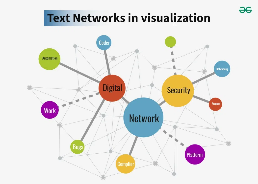
- Revealing relationships between words or concepts in textual data.
- They support the identification of connections, overarching themes, and conceptual co-occurrences in the data.
- Text networks are useful for investigating semantic structures and may be used to the creation of theories or the comprehension of intricate connections.
3. Heatmaps
Within a matrix, data values are represented by color changes in heatmaps. They are used in qualitative research to illustrate the prevalence of certain themes or codes among various variables or time periods. Heatmaps provide a concise visual synopsis that facilitates the identification of noteworthy regions or unforeseen outcomes.

- Identifying patterns or clusters in qualitative data.
- Visualizing the intensity or density of themes or concepts across multiple dimensions.
- Highlighting areas of interest or divergence within a dataset.
4. Chronology charts
Chronology charts are a great tool for showing how themes or ideas change over time, particularly in studies that follow a subject across time or when examining how an idea or phenomena develops.

- Illustrating the chronological order of events, actions, or developments.
- Visualizing temporal patterns, trends, or changes over time.
- Analyzing the sequence of activities or decision-making processes.
5. Mind maps and Concept Maps
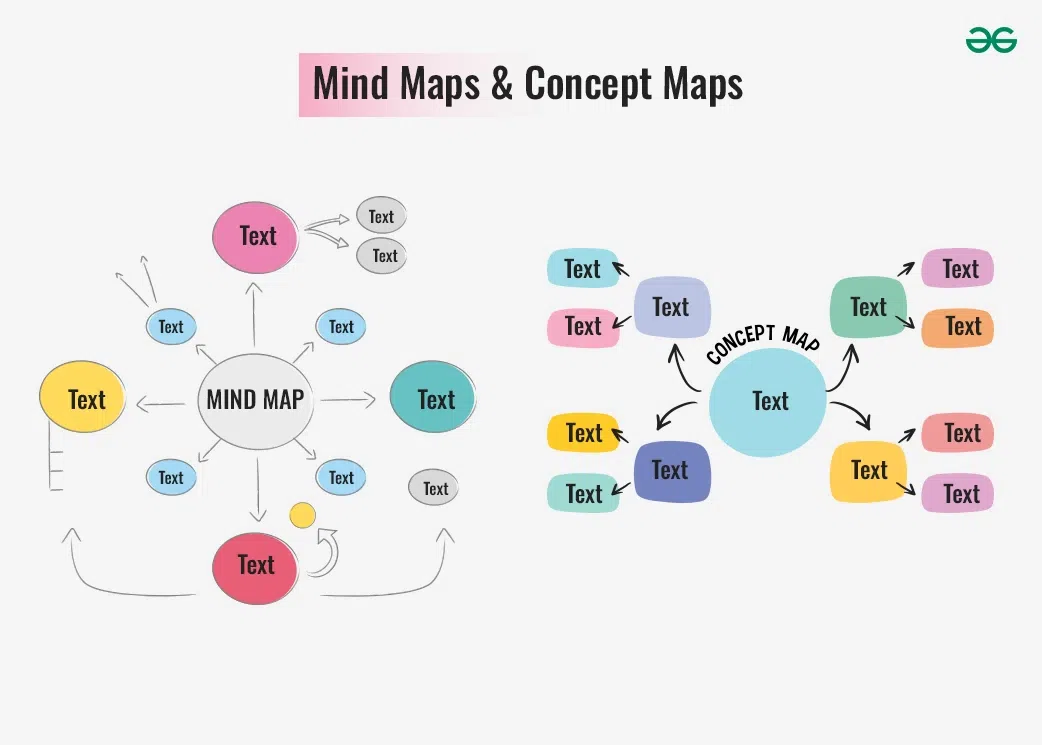
- Organizing and structuring complex qualitative data into hierarchical frameworks.
- Visualizing relationships between concepts, ideas, or components of a system.
- Brainstorming ideas, exploring connections, and generating new insights.
6. Flow charts
Flow charts are an effective tool in data visualization approaches for qualitative research. They provide a visual depiction of processes, workflows, and linkages, making complicated information more accessible and understandable. Flow charts assits in depicting phases of the research process, from data collection to analysis.
They are used to map narrative structures, demonstrating how tales or events are related within the data visualizing the sequence of steps or stages in a workflow.
Helpful in clarifying complex systems or pathways in a visual format.
-copy-2.webp)
7. Narrative Visualizations
Narrative visualizations are effective data visualization strategies for qualitative research. They blend narrative elements with visual data representation to communicate ideas and conclusions in an engaging and intelligible way. Narrative visualizations lead the audience through the data, offering context, emphasizing key results, and making difficult material more understandable. This strategy is especially useful in qualitative research, where data is often composed of textual material, interviews, and observational notes.
Narrative visualizations enhance understanding by presenting complicated qualitative by:

- Combining text, visuals, and multimedia elements to engage audiences.
- Exploring complex qualitative insights through interactive storytelling.
- Narrative visualizations help to communicate qualitative results to a larger audience, including non-experts.
Importance of Data Visualization in Qualitative Research
For several reasons, data visualization is essential in qualitative research:
- Improved Communication: Compared to text alone, visualization is a more effective tool for explaining complicated concepts and connections. Graphs, charts, and diagrams may help make complex relationships easier to understand for a wider range of people, including those with different degrees of subject matter experience.
- Promote Insights: Patterns and trends that would otherwise go undetected in raw qualitative data can be made visible via the use of visual representations of data. With the comprehensive perspective that visualizations provide, researchers may more easily spot relationships, anomalies, and patterns.
- Engage Audiences: Stylish, well-thought-out images have the power to pique the attention of both the general audience and stakeholders. This interaction promotes further investigation and conversation as well as a better comprehension of the study results.
- Memorability: People tend to remember images better than words. The possibility that important ideas will be remembered and maintained by the audience is increased when study results are presented graphically.
- Assist in Decision-Making: By offering a concise summary of the study findings, visual data representations help in well-informed decision-making. For stakeholders and policymakers who must analyze and act upon study findings, this is very helpful.
Best Practices for Visualizing Qualitative Data
In order to guarantee the efficient and accurate representation of qualitative data, consider below recommended practices:
- Clarity and Simplicity: To make the message understandable and obvious, aim for simplicity in your visualizations. Refrain from overcomplication, since it might overshadow the main points.
- Preserve Context: Make sure the original data's richness and context are preserved in the display. Avoid simplifying things too much. Where needed, use more language or notes to help explain.
- Effective Use of Color: While color may improve understanding, too much of it or the wrong kind of color can take away from the content. Use color deliberately and consistently to draw attention to connections or patterns.
- Label and Annotate: To aid viewers in understanding, provide relevant labels, titles, and annotations. Make sure the main points can be understood even in the absence of more explanation and that the visuals are self-explanatory.
- To achieve a unified and polished appearance, keep design components, typefaces, and color schemes consistent throughout visualizations. Maintaining consistency improves the overall visual appeal and facilitates comparisons.
- Investigate Several Representations: Try out several visualization strategies to see which one best suits your data. Instead of depending on just pre-made chart types, think about creating custom visualizations that are suited to your particular dataset.
Conclusion
For qualitative researchers, data visualization is an invaluable tool that helps them make sense of complicated, rich data and detect patterns as well as explain results. Researchers are able to adequately portray and study the intricacies and complexity of human experiences, actions, and views by using suitable approaches, best practices, and developing technology. Data visualization will play a more and more important role in supporting comprehension, teamwork, and powerful narrative as qualitative research develops.
Similar Reads
Techniques for Data Visualization and Reporting Data Visualization and reporting are ways to present a bunch of information provocatively, that is interactive and engaging for the viewer and the audience in mass amounts. In this article, we examine the main tools for data visualization and identify the important variables that affect the selectio
8 min read
Data Visualization in Infographics: Techniques and Examples Data visualization and infographics are powerful tools for communicating complex information in an easily digestible format. By combining these two techniques, you can create compelling visual stories that engage your audience and convey your message effectively. Data Visualization in InfographicsTh
5 min read
Data Visualization Interview Questions Step into the dynamic world of Data Visualization Interview Questions, where the power of visual storytelling meets the precision of data analysis. In today's data-driven world, the ability to effectively communicate insights through visualization is a coveted skill sought after by employers across
15+ min read
The Art and Science of Data Visualization Data visualization is both an art and a science, blending creativity and technical skill to transform raw data into meaningful insights. It bridges the gap between complex information and human understanding, enabling us to see patterns, trends, and relationships that might otherwise remain hidden.
6 min read
Art of Data Visualization: Essential Tips for Effective Storytelling In an era where data is ubiquitous, the ability to effectively visualize this data is crucial. Whether you are a data scientist, business analyst, or marketer, crafting clear and engaging visualizations can significantly amplify the impact of your findings and help drive informed decisions. Table of
6 min read