Data visualization can be done by seaborn and it can transform complex datasets into clear visual representations making it easier to understand, identify trends and relationships within the data. This article will guide you through various plotting functions available in Seaborn.
Data Visualization with Seaborn
Getting Started with Seaborn
Seaborn is a Python data visualization library that simplifies the process of creating complex visualizations. It is specifically designed for statistical data visualization making it easier to understand data distributions and relationships between them. It is built on the top of matplotlib library and closely integrate with data structures from pandas.
Key Features of Seaborn:
- High-level interface: Simplifies the creation of complex visualizations.
- Integration with Pandas: Works with Pandas DataFrames for data manipulation.
- Built-in themes: Offers attractive default themes and color palettes.
- Statistical plots: Provides various plot types to visualize statistical relationships and distributions.
Installing Seaborn for Data Visualization
Before using Seaborn, you’ll need to install it. The easiest way to install Seaborn is using pip, the Python package manager for python environment:
pip install seaborn
For more, please refer to below links:
Creating Basic Plots with Seaborn
Before starting let’s have a small intro of bivariate and univariate data:
- Bivariate data: This type of data involves two different variables. The analysis of bivariate data deals with causes and relationships and the analysis is done to find out the relationship between the two variables.
- Univariate data: This type of data consists of only one variable. The analysis of univariate data is simple for analysis since the information deals with only one quantity that changes. It does not deal with relationships between different features and the main purpose of the analysis is to describe the data and find patterns that exist within it.
Seaborn offers a variety of plot to visualize different aspects of data. It helps to visualize the statistical relationships to understand how variables in a dataset are related to each another. Below are some common plots you can create using Seaborn:
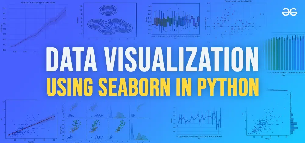
1. Line plot
Lineplot is the most popular plot to draw a relationship between x and y with the possibility of several semantic groupings. It is often used to track changes over intervals.
Syntax : sns.lineplot(x=None, y=None)
Parameters:
x, y: Input data variables; must be numeric. Can pass data directly or reference columns in data.
Let’s visualize the data with a line plot and pandas:
Python import pandas as pd import seaborn as sns data = {'Name':[ 'Mohe' , 'Karnal' , 'Yrik' , 'jack' ], 'Age':[ 30 , 21 , 29 , 28 ]} df = pd.DataFrame( data ) sns.lineplot( data['Age'], data['Weight']) Output:
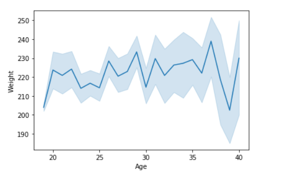
2. Scatter Plot
Scatter plots are used to visualize the relationship between two numerical variables. They help identify correlations or patterns. It can draw a two-dimensional graph.
Syntax: seaborn.scatterplot(x=None, y=None)
Parameters:
x, y: Input data variables that should be numeric.
Returns: This method returns the Axes object with the plot drawn onto it.
Let’s visualize the data with a scatter plot and pandas:
Python import pandas as pd import seaborn as sns data = {'Name':[ 'Mohe' , 'Karnal' , 'Yrik' , 'jack' ], 'Age':[ 30 , 21 , 29 , 28 ]} df = pd.DataFrame( data ) seaborn.scatterplot(data['Age'],data['Weight']) Output:
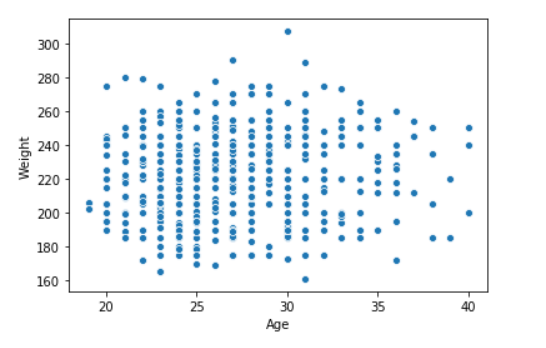
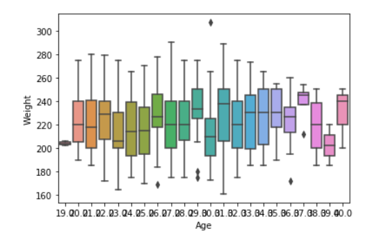
3. Box plot
A box plot is the visual representation of the depicting groups of numerical data with their quartiles against continuous/categorical data.
A box plot consists of 5 things Minimum ,First Quartile or 25% , Median (Second Quartile) or 50%, Third Quartile or 75% and Maximum
Syntax:
seaborn.boxplot(x=None, y=None, hue=None, data=None)
Parameters:
- x, y, hue: Inputs for plotting long-form data.
- data: Dataset for plotting. If x and y are absent this is interpreted as wide-form.
Returns: It returns the Axes object with the plot drawn onto it.
Let’s create box plot with seaborn with an example.
Python import pandas as pd import seaborn as sns # initialise data of lists data = {'Name':[ 'Mohe' , 'Karnal' , 'Yrik' , 'jack' ], 'Age':[ 30 , 21 , 29 , 28 ]} df = pd.DataFrame( data ) sns.boxplot( data['Age'] ) Output:
Example 2: Let’s see create box plot with more features
Output:
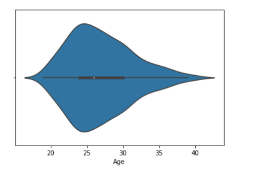
4. Violin Plot
A violin plot is similar to a boxplot. It shows several quantitative data across one or more categorical variables such that those distributions can be compared.
Syntax: seaborn.violinplot(x=None, y=None, hue=None, data=None)
Parameters:
- x, y, hue: Inputs for plotting long-form data.
- data: Dataset for plotting.
Example 1: Draw the violin plot with Pandas
Python import pandas as pd import seaborn as sns # initialise data of lists data = {'Name':[ 'Mohe' , 'Karnal' , 'Yrik' , 'jack' ], 'Age':[ 30 , 21 , 29 , 28 ]} df = pd.DataFrame( data ) sns.violinplot(data['Age']) Output:
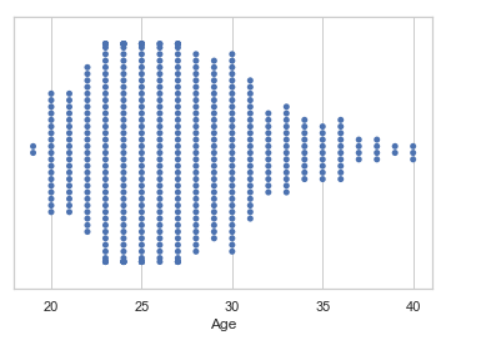
5. Swarm plot
A swarm plot is similar to a strip plot we can draw a swarm plot with non-overlapping points against categorical data.
Syntax: seaborn.swarmplot(x=None, y=None, hue=None, data=None)
Parameters:
- x, y, hue: Inputs for plotting long-form data.
- data: Dataset for plotting.
Example : Draw the swarm plot with Pandas
Python import seaborn seaborn.set(style = 'whitegrid') data = pandas.read_csv( "nba.csv" ) seaborn.swarmplot(x = data["Age"])
Output:
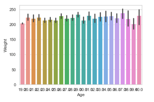
6. Bar plot
Barplot represents an estimate of central tendency for a numeric variable with the height of each rectangle and provides some indication of the uncertainty around that estimate using error bars.
Syntax : seaborn.barplot(x=None, y=None, hue=None, data=None)
Parameters :
- x, y : This parameter take names of variables in data or vector data, Inputs for plotting long-form data.
- hue : (optional) This parameter take column name for colour encoding.
- data : (optional) This parameter take DataFrame, array, or list of arrays, Dataset for plotting. If x and y are absent, this is interpreted as wide-form. Otherwise it is expected to be long-form.
Returns : Returns the Axes object with the plot drawn onto it.
Example : Draw the bar plot with Pandas
Python import seaborn seaborn.set(style = 'whitegrid') data = pandas.read_csv("nba.csv") seaborn.barplot(x ="Age", y ="Weight", data = data) Output:
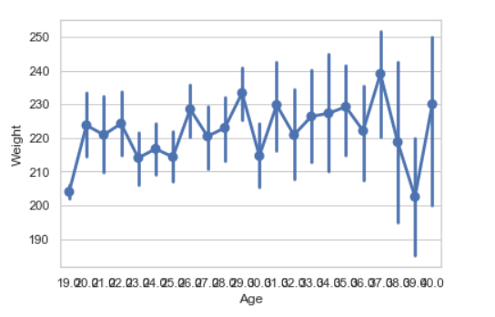
7. Point plot
Point plot used to show point estimates and confidence intervals using scatter plot glyphs. A point plot represents an estimate of central tendency for a numeric variable by the position of scatter plot points and provides some indication of the uncertainty around that estimate using error bars.
Syntax:seaborn.pointplot(x=None, y=None, hue=None, data=None)
Parameters:
- x, y: Inputs for plotting long-form data.
- hue: (optional) column name for color encoding.
- data: dataframe as a Dataset for plotting.
Return: The Axes object with the plot drawn onto it.
Example: Draw the point plot with Pandas
Python import seaborn seaborn.set(style = 'whitegrid') data = pandas.read_csv("nba.csv") seaborn.pointplot(x = "Age", y = "Weight", data = data) Output:
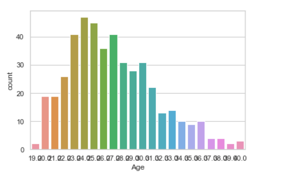
8. Count plot
A Count plot in Seaborn displays the number of occurrences of each category using bars to visualize the distribution of categorical variables.
Syntax : seaborn.countplot(x=None, y=None, hue=None, data=None)
Parameters :
- x, y: This parameter take names of variables in data or vector data, optional, Inputs for plotting long-form data.
- hue : (optional) This parameter take column name for color encoding.
- data : (optional) This parameter take DataFrame, array, or list of arrays, Dataset for plotting. If x and y are absent, this is interpreted as wide-form. Otherwise, it is expected to be long-form.
Returns: Returns the Axes object with the plot drawn onto it.
Example: Draw the count plot with Pandas
Python import seaborn seaborn.set(style = 'whitegrid') data = pandas.read_csv("nba.csv") seaborn.countplot(data["Age"]) Output:
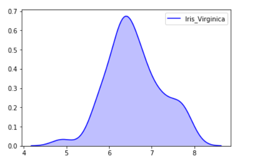
9. KDE Plot
KDE Plot described as Kernel Density Estimate is used for visualizing the Probability Density of a continuous variable. It depicts the probability density at different values in a continuous variable. We can also plot a single graph for multiple samples which helps in more efficient data visualization.
Syntax: seaborn.kdeplot(x=None, *, y=None, vertical=False, palette=None, **kwargs)
Parameters:
- x, y : vectors or keys in data
- vertical : boolean (True or False)
- data : pandas.DataFrame, numpy.ndarray, mapping, or sequence
Example : Draw the KDE plot with Pandas
Python from sklearn import datasets import pandas as pd import seaborn as sns iris = datasets.load_iris() iris_df = pd.DataFrame(iris.data, columns=['Sepal_Length', 'Sepal_Width', 'Patal_Length', 'Petal_Width']) iris_df['Target'] = iris.target iris_df['Target'].replace([0], 'Iris_Setosa', inplace=True) iris_df['Target'].replace([1], 'Iris_Vercicolor', inplace=True) iris_df['Target'].replace([2], 'Iris_Virginica', inplace=True) sns.kdeplot(iris_df.loc[(iris_df['Target'] =='Iris_Virginica'), 'Sepal_Length'], color = 'b', shade = True, Label ='Iris_Virginica')
Output:
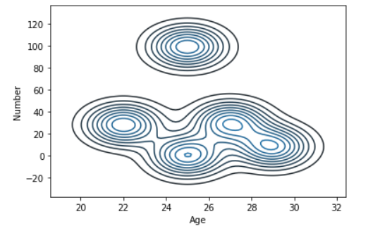
Example 2: KDE plot for Age and Number Feature
Python import seaborn as sns import pandas data = pandas.read_csv("nba.csv").head() sns.kdeplot( data['Age'], data['Number']) Output:
Customizing Seaborn Plots with Python
To Customize Seaborn plots we use various methods. They are used improve their readability and aesthetics.
1. Changing Plot Style and Theme
Seaborn offers several built-in themes that can be used to change the overall look of the plots. These themes include darkgrid , whitegrid , dark, white and ticks.
Python import seaborn as sns import matplotlib.pyplot as plt sns.set_style("whitegrid") sns.boxplot(x='species', y='petal_length', data=sns.load_dataset('iris')) plt.title('Petal Length Distribution by Species') plt.show() Output:
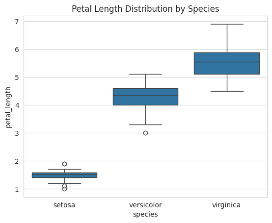
Changing Plot Style and Theme
2. Customizing Color Palettes
Seaborn allows you to use different color palettes to enhance the visual appeal of your plots. You can use predefined predefined color palettes like “deep” and “muted,” or you can create custom ones using functions like sns.color_palette().
Python custom_palette = sns.color_palette("husl", 8) sns.set_palette(custom_palette) sns.violinplot(x='species', y='petal_length', data=sns.load_dataset('iris')) plt.title('Petal Length Distribution by Species') plt.show() Output:
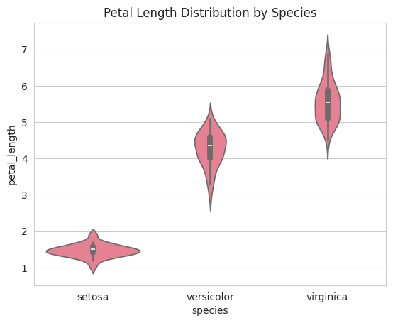
Customizing Color Palettes
3. Adding Titles and Axis Labels
You can add descriptive titles and labels You can add titles and axis labels to Seaborn plots using plt.title(),plt.xlabel(), plt.ylabel() .This helps make your plots more understandable and informative for to your plots can make them more informative. Let’s understand how to implement them
Python sns.scatterplot(x='sepal_length', y='sepal_width', data=sns.load_dataset('iris')) plt.title('Sepal Length vs Sepal Width') plt.xlabel('Sepal Length (cm)') plt.ylabel('Sepal Width (cm)') plt.show() Output:

Adding Titles and Axis Labels
You can adjust the figure size using plt.figure(figsize=(width,height)) to control the plot’s dimensions. This allows for better customization to fit different presentation or reports.
Python plt.figure(figsize=(10, 6)) sns.lineplot(x='year', y='passengers', data=sns.load_dataset('flights')) plt.title('Number of Passengers Over Time') plt.show() Output:
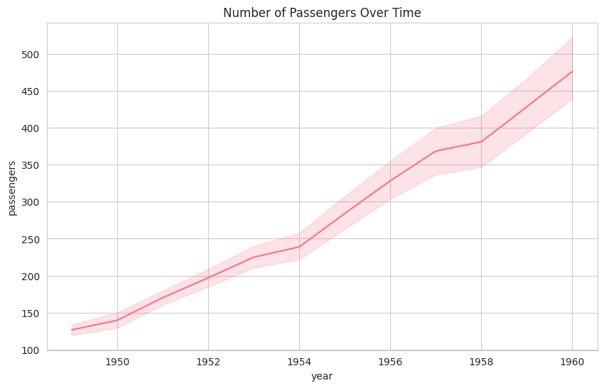
Adjusting Figure Size and Aspect Ratio
5. Adding Markers to Line Plots
Markers can be added to Seaborn line plots using themarker argument to highlight data points. For example adds circular markers to the line plot. Now understand it with the help of example: sns.lineplot(x=’x’, y=’y’ ,marker=’o’)
Python sns.lineplot(x='year', y='passengers', data=sns.load_dataset('flights'), marker='o') plt.title('Number of Passengers Over Time') plt.show() Output:
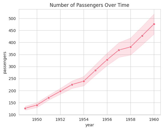
Adding Markers to Line Plots
Pair Plots
Pair plots visualize relationships between variables in a dataset. They plot pairwise scatter plots for all combinations of variables, along with univariate distributions on the diagonal. This is useful for exploring datasets with multiple variables and seeing potential correlations. Great for exploring patterns, correlations, and distributions in datasets with multiple numeric variables.
Syntax: sns.pairplot(data, hue=None)
Example:
Python import seaborn as sns import matplotlib.pyplot as plt data = sns.load_dataset("iris") sns.pairplot(data, hue="species") plt.show() Output:
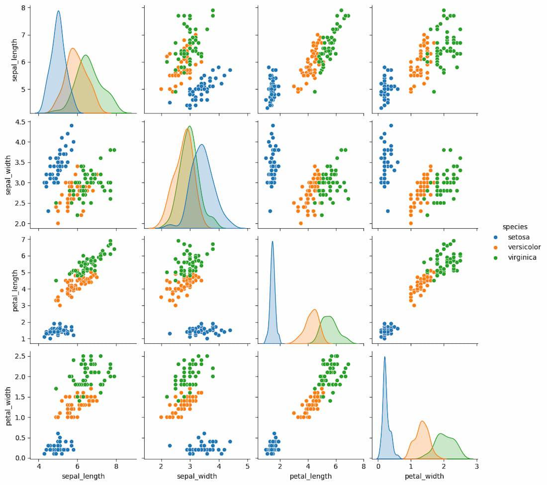
Pair plot
The pairplot automatically generates a grid of scatter plots showing relationships between each pair of features. The hue parameter adds a color code based on categorical variables like species in the Iris dataset.
Joint Plots
Joint plots combine a scatter plot with the distributions of the individual variables. This allows for a quick visual representation of how the variables are distributed individually and how they relate to one another.
Syntax: sns.jointplot (x, y, data, kind=’scatter’)
Example:
Python import seaborn as sns import matplotlib.pyplot as plt data = sns.load_dataset("tips") sns.jointplot(x="total_bill", y="tip", data=data, kind="scatter") plt.show() Output:
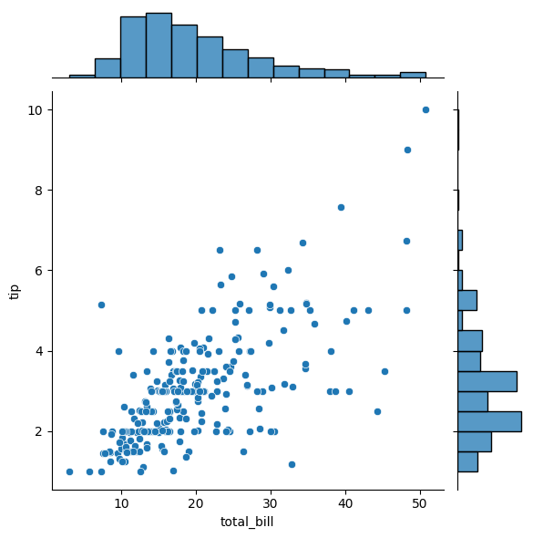
Joint Plot
This creates a scatter plot between total_bill and tip with histograms of the individual distributions along the margins. The kind parameter can be set to ‘kde’ for kernel density estimates or ‘reg’ for regression plots.
Grid Plot
Grid plots in Seaborn are a powerful way to visualize data across multiple dimensions.
- They allow you to create a grid of plots based on subsets of your data, making it easier to compare different groups or conditions.
- This is particularly useful in exploratory data analysis when you want to understand how different variables interact with each other across different categories.
A grid plot, specifically using Seaborn’s FacetGrid is a multi-plot grid that allows you to map a function (such as a plot) onto a grid of subplots.
Creating Multi-Plot Grids with Seaborn’s FacetGrid
Seaborn’s FacetGrid is a powerful tool for visualizing data by creating a grid of plots based on subsets of your dataset. It is particularly useful for exploring complex datasets with multiple categorical variables.
Example: To use FacetGrid, you first need to initialize it with a dataset and specify the variables that will form the row, column, or hue dimensions of the grid. Here is an example using the tips dataset:
Python import seaborn as sns import matplotlib.pyplot as plt tips = sns.load_dataset("tips") g = sns.FacetGrid(tips, col="time", row="sex") Output:
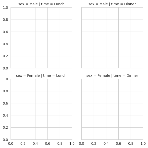
Multi-Plot Grids with Seaborn’s FacetGrid
Illustrating Regression Relationships With Seaborn
Seaborn simplifies the process of performing and visualizing regressions specifically linear regressions which is crucial for identifying relationships between variables, detecting trends and making predictions. Seaborn supports two primary functions for regression visualization:
regplot(): This function plots a scatter plot along with a linear regression model fit.lmplot(): This function also plots linear models but provides more flexibility in handling multiple facets and datasets.
Example: Let’s use a simple dataset to visualize a linear regression between two variables: x (independent variable) and y (dependent variable).
Python import seaborn as sns import matplotlib.pyplot as plt tips = sns.load_dataset('tips') sns.regplot(x='total_bill', y='tip', data=tips, scatter_kws={'s':10}, line_kws={'color':'red'}) plt.show() Output:
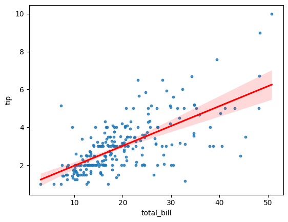
Reg Plot
In conclusion by using Seaborn data scientists can create a wide variety of plots to uncover patterns, trends and relationships within their data. As you explore Seaborn further experiment with different plot types, customizations and datasets to gain a deeper understanding visually.
Similar Reads
Python - Data visualization tutorial
Data visualization is a crucial aspect of data analysis, helping to transform analyzed data into meaningful insights through graphical representations. This comprehensive tutorial will guide you through the fundamentals of data visualization using Python. We'll explore various libraries, including M
7 min read
What is Data Visualization and Why is It Important?
Data visualization is the graphical representation of information. In this guide we will study what is Data visualization and its importance with use cases. Understanding Data VisualizationData visualization translates complex data sets into visual formats that are easier for the human brain to unde
4 min read
Data Visualization using Matplotlib in Python
Matplotlib is a powerful and widely-used Python library for creating static, animated and interactive data visualizations. In this article, we will provide a guide on Matplotlib and how to use it for data visualization with practical implementation. Matplotlib offers a wide variety of plots such as
13 min read
Data Visualization with Seaborn - Python
Data visualization can be done by seaborn and it can transform complex datasets into clear visual representations making it easier to understand, identify trends and relationships within the data. This article will guide you through various plotting functions available in Seaborn. Getting Started wi
13 min read
Data Visualization with Pandas
Pandas allows to create various graphs directly from your data using built-in functions. This tutorial covers Pandas capabilities for visualizing data with line plots, area charts, bar plots, and more. Introducing Pandas for Data VisualizationPandas is a powerful open-source data analysis and manipu
5 min read
Plotly for Data Visualization in Python
Plotly is an open-source Python library for creating interactive visualizations like line charts, scatter plots, bar charts and more. In this article, we will explore plotting in Plotly and covers how to create basic charts and enhance them with interactive features. Introduction to Plotly in Python
13 min read
Data Visualization using Plotnine and ggplot2 in Python
Plotnoine is a Python library that implements a grammar of graphics similar to ggplot2 in R. It allows users to build plots by defining data, aesthetics, and geometric objects. This approach provides a flexible and consistent method for creating a wide range of visualizations. It is built on the con
7 min read
Introduction to Altair in Python
Altair is a statistical visualization library in Python. It is a declarative in nature and is based on Vega and Vega-Lite visualization grammars. It is fast becoming the first choice of people looking for a quick and efficient way to visualize datasets. If you have used imperative visualization libr
5 min read
Python - Data visualization using Bokeh
Bokeh is a data visualization library in Python that provides high-performance interactive charts and plots. Bokeh output can be obtained in various mediums like notebook, html and server. It is possible to embed bokeh plots in Django and flask apps. Bokeh provides two visualization interfaces to us
3 min read
Pygal Introduction
Python has become one of the most popular programming languages for data science because of its vast collection of libraries. In data science, data visualization plays a crucial role that helps us to make it easier to identify trends, patterns, and outliers in large data sets. Pygal is best suited f
5 min read