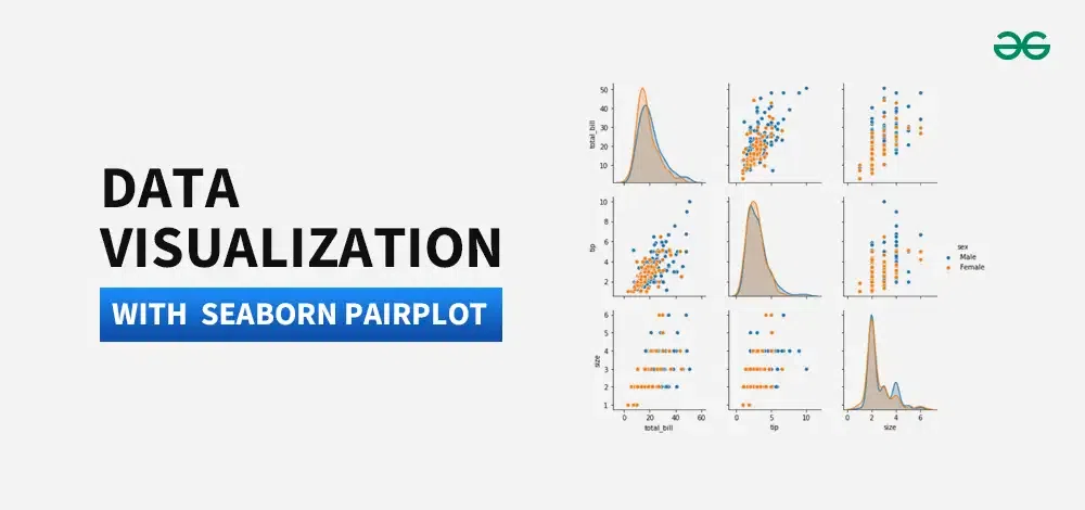
Data visualization with Seaborn Pairplot
Last Updated : 11 Jun, 2024
Data Visualization is the presentation of data in pictorial format. It is extremely important for Data Analysis, primarily because of the fantastic ecosystem of data-centric Python packages. Seaborn is one of those packages that can make analyzing data much easier.
 Data visualization with Seaborn Pairplot
 In this article, we will use Pairplot Seaborn to analyze data and, using the sns.pairplot() function.
Pairplot in Seaborn is a data visualization tool that creates a matrix of scatterplots, showing pairwise relationships between variables in a dataset, aiding in visualizing correlations and distributions.
PairPlot Seaborn : Implementation
To implement a Pair Plot using Seaborn, you can follow these steps:
To plot multiple pairwise bivariate distributions in a dataset, you can use the pairplot() function. This shows the relationship for (n, 2) combination of variable in a DataFrame as a matrix of plots and the diagonal plots are the univariate plots.
Syntax: seaborn.pairplot( data, \*\*kwargs )
Parameter:
data: Tidy (long-form) dataframe where each column is a variable and each row is an observation.
hue: Variable in “data“ to map plot aspects to different colors.
palette: dict or seaborn color palette
{x, y}_vars: lists of variable names, optional
dropna: boolean, optional
First of all, We see Upload seaborn librarry 'tips' using pandas. Then, we will visualize data with seaborn.
Python # importing packages import seaborn import matplotlib.pyplot as plt # loading dataset using seaborn df = seaborn.load_dataset('tips') df.head() Output:
total_bill tip sex smoker day time size 0 16.99 1.01 Female No Sun Dinner 2 1 10.34 1.66 Male No Sun Dinner 3 2 21.01 3.50 Male No Sun Dinner 3 3 23.68 3.31 Male No Sun Dinner 2 4 24.59 3.61 Female No Sun Dinner 4
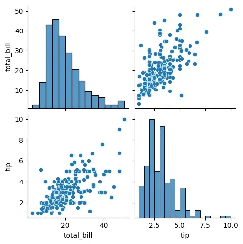
Let's plot pairplot using seaborn:
We will simply plot a pairplot with tips data frame.
Python seaborn.pairplot(df) plt.show()
Output:
 seaborn pairplot
Each combination of variables is represented by a scatter plot, and the diagonal plots show the distribution of each individual variable.
- The relationship between
total_bill and tip is stronger for larger parties. - There is a positive correlation between
tip and size. - The relationship between
tip and size is stronger for larger total bill amounts. - There is a weak positive correlation between
total_bill and size. This means that larger parties tend to have larger bills, but the relationship is not very strong. - There is no clear relationship between
sex and tip or total_bill. - There is a weak positive correlation between
day and total_bill. This means that bills tend to be slightly larger on Saturdays and Fridays than on other days of the week. - There is no clear relationship between
time and tip or total_bill. - There is a weak positive correlation between
smoker and tip. This means that smokers tend to tip slightly more than non-smokers.
1. Pairplot Seaborn: Plotting Selected Variables
Python import seaborn as sns import matplotlib.pyplot as plt df = sns.load_dataset('tips') selected_vars = ['total_bill', 'tip'] sns.pairplot(df, vars=selected_vars) plt.show() Output:
 paiplot seaborn
The plots on the diagonal show the distribution of each individual variable. For example, the top left plot shows the distribution of total bills, and the bottom right plot shows the distribution of tips.
The off-diagonal plots show the relationship between two variables. For example, the top right plot shows the relationship between total bill and tip. There is a positive correlation between these two variables, which means that larger bills tend to have larger tips.
2. Pairplot Seaborn: Adding a Hue Color to a Seaborn Pairplot
Python import seaborn import matplotlib.pyplot as plt df = seaborn.load_dataset('tips') seaborn.pairplot(df,hue ='size') plt.show() Output:
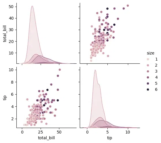 pairplot seabon
The points in this scatter plot are colored by the value of size, so you can see how the relationship between total_bill and tip varies depending on the size of the party.
- There is a positive correlation between
total_bill and tip. This means that, in general, larger bills tend to have larger tips. - There is a positive correlation between
tip and size. This means that, in general, larger parties tend to have larger tips. - The relationship between
tip and size is stronger for larger total bill amounts.
3. Pairplot Seaborn: Modifying Color Palette
Python import seaborn as sns import matplotlib.pyplot as plt df = sns.load_dataset('tips') sns.pairplot(df, hue="size", palette="husl") plt.show Output:

4. Pairplot Seaborn: Diagonal Kind of plots
In Seaborn's Pairplot, the 'diag_kind' parameter specifies the type of plot to display along the diagonal axis, representing the univariate distribution of each variable. Options include 'hist' for histograms, 'kde' for kernel density estimates, and 'scatter' for scatterplots. Choose based on the nature of the data and analysis goals. Here, let's plot with kernel density estimates.
Python import seaborn as sns import matplotlib.pyplot as plt df = sns.load_dataset('tips') sns.pairplot(df,diag_kind = 'kde') plt.show Output:

5. Pairplot Seaborn:Adjusting Plot Kind
The kind parameter allows to change the type of plot used for the off-diagonal plots. You can choose any like scatter, kde, or reg (regression).
Python sns.pairplot(df, kind='reg') plt.show()
Output:
.webp) Adjusting Plot Kind
Adjusting Plot Kind6. Pairplot Seaborn:Controlling the Markers
The markers parameter allows you to specify different markers for different categories.
Python sns.pairplot(df, hue='sex', markers=["o", "s"]) plt.show()
Output:
.webp) Controlling the Markers
Controlling the Markers7. Pairplot Seaborn:Limiting the Variables
If you are interested in only a subset of the variables, you can specify them using the vars parameter.
Python sns.pairplot(df, hue='sex', vars=['total_bill', 'tip', 'size']) plt.show()
Output:
.webp) Pairplot Seaborn:Limiting the Variables
Pairplot Seaborn:Limiting the VariablesAdvanced Customization With Seaborn Pairplot
For advanced customization, you can access the underlying FacetGrid object and modify it further.
Python g = sns.pairplot(df, hue='day') g.fig.suptitle("Pairplot of Tips Dataset", y=1.02) # Add a title g.set(xticks=[], yticks=[]) # Remove tick labels plt.show() Output:
.webp) Advanced Customization With Seaborn Pairplot
Advanced Customization With Seaborn PairplotConclusion
Pairplot in Seaborn is a powerful tool for visualizing relationships, patterns, and distributions in multivariate datasets. It simplifies data analysis by creating a matrix of scatterplots, providing insights into both univariate distributions and bivariate relationships. The customization options, such enhance its flexibility.
Similar Reads
Introduction
Styling Plots
Multiple Plots
Scatter Plot
Line Plot
Bar Plot
Count Plot
Box Plot
Violin Plot
Strip Plot