Data Visualization in Infographics: Techniques and Examples
Last Updated : 23 Jun, 2024
Data visualization and infographics are powerful tools for communicating complex information in an easily digestible format. By combining these two techniques, you can create compelling visual stories that engage your audience and convey your message effectively.
 Data Visualization in Infographics
This article will guide you through the process of using data visualization in infographics, providing tips, best practices, and examples to help you get started.
Understanding Data Visualization and Infographics
- Data Visualization is the graphical representation of information and data. By using visual elements like charts, graphs, and maps, data visualization tools provide an accessible way to see and understand trends, outliers, and patterns in data.
- Infographics are visual representations of information, data, or knowledge intended to present information quickly and clearly. They combine data visualizations, illustrations, and text to tell a comprehensive story.
Key Differences Between Data Visualization and Infographics
| Characteristics | Data Visualization | Infographic |
|---|
| Purpose | Present specific, quantifiable data to facilitate understanding and analysis | Tell a comprehensive story by combining data visualizations with other visual elements and text |
|---|
| Scope | Focuses on a small, specific set of data | Covers a range of topics, including subjective ones |
|---|
| Interactivity | Often interactive, especially in digital platforms | Generally non-interactive |
|---|
| Design and Aesthetics | Simple, functional design | More visually appealing, with a focus on storytelling |
|---|
| Type of Data | Presents precise, quantitative data | Can present both quantitative and qualitative data |
|---|
| Automation | Often generated automatically using software | Requires manual creation and organization of elements |
|---|
| Applications | Commonly used in digital platforms like apps, computer programs, and online portals | Suitable for a broader range of applications, including print media, blogs, and presentations |
|---|
Steps to Incorporate Effective Data Visualizations in Infographics
1. Define Your Purpose and Audience
Before creating an infographic, it's crucial to understand the purpose of your data visualization and who your audience is. This will guide your design choices and ensure that your infographic effectively communicates your message.
2. Choose the Right Type of Visualization Techniques
Different types of data require different visualization techniques. Here are some common types of data visualizations and their uses:
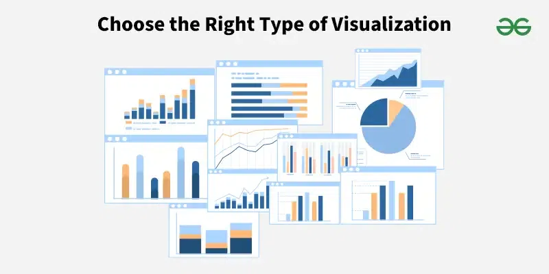 Right Type of Visualization Techniques
- Bar Charts: Use for comparing quantities (e.g., the bar chart at the top of the image).
- Line Graphs: Ideal for showing trends over time (e.g., the line graph in the middle of the image).
- Pie Charts and Radial Charts: Best for displaying proportions (e.g., the radial chart on the right side of the image).
- Geometric Shapes and Patterns: Use for illustrating complex relationships or structures (e.g., the geometric shapes in the middle of the image).
- Icons and Symbols: Represent different data types and categories (e.g., the various icons throughout the image).
3. Simplify Complex Data : Less is More
A key principle in creating effective infographics is to simplify complex data.
- Don't overload the eye with designs; instead, use simple, clean styles.
- To preserve clarity, keep a single visualization's data set to a minimum.
- To focus attention to the most crucial information, highlight the most significant data elements.
 Simplify Complex Data : Less is More
4. Use Color Wisely
Color plays a significant role in data visualization. It can highlight essential information, create visual hierarchies, and make your infographic more engaging. However, it's important to use color strategically to avoid overwhelming your audience.
- For a unified appearance, choose a consistent color scheme.
- To differentiate between distinct data sets and draw attention to key information, use contrasting color's.
- Make sure your color palettes are easily discernible for people who are colorblind.
 Selecting Color Wisely
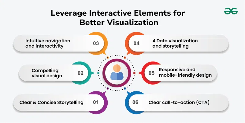
5. Leverage Interactive Elements
To enhance engagement, utilize interactive elements:
- Use interactive elements to deliver more information and improve user engagement, such as clickable regions or hover effects.
- When highlighting significant data transitions or changes, use animations judiciously so as not to detract from the main point.
 Leverage Interactive Elements
6. Ensure Accuracy and Integrity
Accuracy is paramount in data visualization. Label your graphs appropriately and use scales to avoid distorting the information. Clear and accurate visualizations build trust with your audience.
- Use reliable and precise information from all sources at all times.
- Steer clear of data manipulation and deceptive visualization's that could lead to incorrect information interpretation.
- To guarantee that viewers can correctly grasp the data, include labels, legends, and scales that are clear.
Examples of Effective Data Visualizations in Infographics
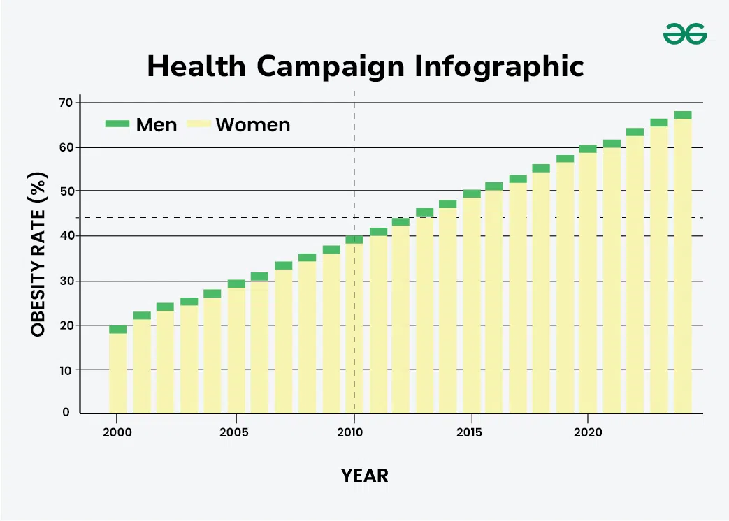
1. Health Campaign Infographic
- Visualization Technique: Bar chart depicting obesity rates over time.
- Purpose: Highlight trends in obesity rates to support a health campaign.
- Design Elements: Minimal text, consistent color scheme, clear labels
 Health Campaign Infographic
2. Smartphone Usage Infographic
- Visualization Technique: Line graph showing smartphone usage over the past decade.
- Purpose: Illustrate trends in smartphone usage by income level.
- Design Elements: Simplified data, strategic use of color, minimal text.
 Smartphone Usage Infographic
3. Spotify Global Trend Report
- Visualization Technique: Various charts and graphs showing music trends.
- Purpose: Engage users by showing the significance of music in people's lives.
- Design Elements: Engaging visuals, brand colors, clear labels.
 Spotify Global Trend Report
 Similar Reads
Techniques for Data Visualization and Reporting Data Visualization and reporting are ways to present a bunch of information provocatively, that is interactive and engaging for the viewer and the audience in mass amounts. In this article, we examine the main tools for data visualization and identify the important variables that affect the selectio
8 min read
Bad Data Visualization Examples Explained Data visualization is crucial in today's global society, simplifying complex data sets for easier comprehension and application. However, not all visualizations are created equal. Bad Data Visualizations can mislead viewers, distort information, and convey incorrect messages. Table of Content Exampl
11 min read
Real Life Data Visualization Examples Data visualization is a powerful tool that translates complex data sets into visual formats, making it easier to understand, interpret, and derive actionable insights. It is used across various industries to make data-driven decisions, identify trends, and communicate findings effectively. Here are
8 min read
Data Visulization Techniques for Qualitative Research Data visualization techniques play a crucial role in qualitative research by helping researchers explore and communicate patterns, relationships, and insights within their data. Here are some effective techniques commonly used in qualitative research. Qualitative data, conveyed through narratives, d
8 min read
The Art and Science of Data Visualization Data visualization is both an art and a science, blending creativity and technical skill to transform raw data into meaningful insights. It bridges the gap between complex information and human understanding, enabling us to see patterns, trends, and relationships that might otherwise remain hidden.
6 min read