The CSS Box Model defines how elements are sized, positioned, and rendered on a webpage. When a browser loads an HTML document, it creates a DOM tree and assigns a box to each element. This box calculates the element's dimensions and position relative to its parent or the root <html> element, ensuring accurate layout and spacing.
Box Model Component Layout
- Content: The area where text or other content is displayed.
- Padding: Space between the content and the element's border.
- Border: A frame that wraps around the padding and content.
- Margin: Space between the element's border and neighbouring elements.

Key components of the box model
1. Content Area
- The content area is the central part of the CSS box model, containing the main content (e.g., text, images, videos, or elements like <p> or <span>).
- It can be styled with CSS properties like height and width.
The content edge refers to the four edges of the content area
- Left content edge
- Right content edge
- Top content edge
- Bottom content edge
2. Padding Area
- The padding area is the space between the content and the border of an element.
- It includes the areas highlighted in light green and skin color in the example.
- The distance between the content edge and the border is the padding.
- The border marks the end of the padding area.
- The padding area contributes to the element's total dimensions.
- Padding can be adjusted using CSS properties.
- It works similarly with box-sizing: content-box and box-sizing: border-box, but with slight calculation differences.
3. Border Area
- The area that marks the end of an element is called as the border it is the outer fencing for the element.
- The default border properties are provided in CSS to control the thickness of this outer fencing.
- The border area also add 's up to the complete height and width of the element.
- The more the border width the more will be the height or width of the element.
- In the above image the area marked with skin color is called the border area.
4. Margin Area
- The area outside the border of an element is called the margin area.
- Basically this area depends on the parent of the element.
- The distance between the border of the parent element and the border of the child element is called as the margin.
- CSS has provides certain margin properties to get control over this scenario.
Box Sizing Property in CSS
There are two type's of box-sizing properties in CSS
1. Content-Box(default property)
When the user set's the value of the box-sizing property for an element as content-box or even if user do not set's it ,it remains by default as content-box and in the actual height and width of the element the dimensions of the content area as well as the padding area is added to constitute the final dimensions of the element.
HTML <!--Driver Code Starts--> <html> <head> <!--Driver Code Ends--> <style> div { height: 200px; width: 200px; box-sizing: content-box; padding-left: 20px; padding-right: 20px; border-left: 2px solid red; border-right: 2px solid red; } </style> <!--Driver Code Starts--> </head> <body> <div>Hello GFG</div> </body> </html> <!--Driver Code Ends--> This code will create a box model with a border line width of 0.4px always and border-area of 1.6px and padding area as 20px width on both sides of the content area.
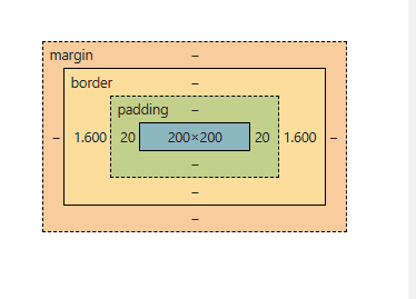
Content Area (Width) :The width of the content area is fixed at 200px.
Padding
- Padding adds extra space inside the element, around the content.
- Padding Left: 20px
- Padding Right: 20px
- Total padding width: 20px + 20px = 40px
Border
- The border, being solid, has a width, but it is calculated differently from the padding.
- Line Width of Border: 0.4px (the width of the line itself)
- Area of Border: 1.6px (the actual space the border occupies visually)
- Border width for both sides: 1.6px (left) + 1.6px (right) = 3.2px
Total Width
- Total width of the element can be calculated by adding the padding and border areas to the content area width.
- Formula for Total Width = (Padding-Left + Padding-Right + Border-Area-Left + Border-Area-Right) + Content Area Width
- Total Width = (20px + 20px + 1.6px + 1.6px) + 200px = 243.2px
- The total width of the element becomes 243.2px.
The reason the total width is increased unexpectedly is because box-sizing: content-box applies the width to the content area only .The padding and border are added outside the content area, leading to an increase in the overall width and height of the element.
2. Border-Box
When the box-sizing property is set as border-box the actual dimensions of the element's remains same as that of the actual dimensions set by the user. The difference it makes is just that the size of the content area get's altered in a manner so that it could accommodate the padding area and the border area so the resultant could be equal to the actual dimensions entered by the user.
HTML <!--Driver Code Starts--> <html> <head> <!--Driver Code Ends--> <style> div { height: 200px; width: 200px; box-sizing:border-box; padding-left: 20px; padding-right: 20px; border-left: 2px solid red; border-right: 2px solid red; } </style> <!--Driver Code Starts--> </head> <body> <div>Hello GFG</div> </body> </html> <!--Driver Code Ends--> This code will create a box model by altering the dimensions specifically the width of the content area to accomodate the padding and the border area with the border line-width.

- Width of Border and Padding Border width : 0.4px (line width) and 1.6px + 1.6px = 3.2px (total border area).
- Padding width : 20px + 20px = 40px.
- User-Entered Width : The width entered by the user is 200px, which applies to the content area only when box-sizing: content-box is used.
- Box-Sizing Behavior :The box-sizing: content-box property adds the padding and border outside the content area, causing the total width to increase.
- Adjusting Content Area Width : To ensure the total width remains 200px, the extra width from padding and borders (40px + 3.2px = 43.2px) is subtracted from the total width.
- New content area width : 200px - 43.2px = 156.8px.
- Final Width Calculation : The final total width is: 156.8px (content area) + 40px (padding) + 3.2px (border) = 200px, ensuring the user’s entered width remains unchanged.
Use Case's of CSS Box Model
1. Default box-sizing: content-box
Default behavior where padding and borders are added outside the content area, leading to an increased overall width/height.
HTML <!--Driver Code Starts--> <html> <head> <!--Driver Code Ends--> <style> div { width: 200px; padding: 20px; border: 5px solid black; box-sizing: content-box; background-color: lightgreen; } </style> <!--Driver Code Starts--> </head> <body> <div>This is a div with box-sizing content-box.</div> </body> </html> <!--Driver Code Ends--> The total width of the element will be 200px + 20px (left) + 20px (right) + 5px (left border) + 5px (right border) = 250px.
2. Using box-sizing: border-box for Consistent Sizing
Ensure the padding and border are included within the specified width/height to maintain a fixed size for layout consistency.
HTML <!--Driver Code Starts--> <html> <head> <!--Driver Code Ends--> <style> div { width: 200px; padding: 20px; border: 5px solid black; box-sizing: border-box; background-color: lightcoral; } </style> <!--Driver Code Starts--> </head> <body> <div>This is a div with box-sizing border-box.</div> </body> </html> <!--Driver Code Ends--> The total width remains 200px, with padding and border included in the 200px size.
3. Setting box-sizing for All Elements
Apply box-sizing: border-box to all elements globally to simplify layout calculations and prevent unexpected element size changes.
HTML <!--Driver Code Starts--> <html> <head> <!--Driver Code Ends--> <style> * { box-sizing: border-box; } div { width: 100%; padding: 20px; border: 2px solid blue; background-color: lightyellow; } </style> <!--Driver Code Starts--> </head> <body> <div>This is a div with border-box applied globally.</div> </body> </html> <!--Driver Code Ends--> All elements are sized consistently, with padding and borders included inside the width/height.
4. Fixed Layout with box-sizing: border-box
Creating a fixed-size element with padding and border without altering the layout dimensions.
HTML <!--Driver Code Starts--> <html> <head> <!--Driver Code Ends--> <style> div { width: 300px; height: 150px; padding: 10px; border: 10px solid green; box-sizing: border-box; background-color: lightblue; } </style> <!--Driver Code Starts--> </head> <body> <div>This is a fixed-size div with box-sizing border-box.</div> </body> </html> <!--Driver Code Ends--> 5. Creating a Responsive Box with box-sizing
Ensuring that padding and borders do not cause layout issues in a responsive design.
HTML <!--Driver Code Starts--> <html> <head> <!--Driver Code Ends--> <style> * { box-sizing: border-box; } .container { max-width: 100%; padding: 20px; border: 5px solid purple; background-color: lightgreen; } </style> <!--Driver Code Starts--> </head> <body> <div class="container">This is a responsive box with border-box.</div> </body> </html> <!--Driver Code Ends--> The element resizes according to the screen width, with padding and borders included in the total size, avoiding overflow.
Similar Reads
CSS Tutorial CSS stands for Cascading Style Sheets. It is a stylesheet language used to style and enhance website presentation. CSS is one of the three main components of a webpage, along with HTML and JavaScript.HTML adds Structure to a web page.JavaScript adds logic to it and CSS makes it visually appealing or
7 min read
CSS Introduction CSS (Cascading Style Sheets) is a language designed to simplify the process of making web pages presentable.It allows you to apply styles to HTML documents by prescribing colors, fonts, spacing, and positioning.The main advantages are the separation of content (in HTML) and styling (in CSS) and the
5 min read
CSS Syntax CSS is written as a rule set, which consists of a selector and a declaration block. The basic syntax of CSS is as follows:The selector is a targeted HTML element or elements to which we have to apply styling.The Declaration Block or " { } " is a block in which we write our CSS.HTML<html> <h
2 min read
CSS Selectors CSS Selectors are used to target HTML elements on your pages, allowing you to apply styles based on their ID, class, type attributes, and more. There are mainly 5 types of selectors.Basic CSS Selectors: These are used to target elements by tag, .class, or # ID for fundamental styling needs.Combinato
7 min read
CSS Comments CSS comments are used to add notes or explanations to your code, helping you and others understand it better. They start with /* and end with */ and can be used for both single-line and multi-line comments. Note: Comments are ignored by browsers, so they won’t affect how your webpage looks or works.
2 min read
CSS Colors CSS colors are used to set the color of different parts of a webpage, like text, background, and borders. This helps make the page look more attractive and easier to read. You can define colors using names, hex codes, RGB values, and more.You can try different formats of colors here- #content-iframe
6 min read
CSS Borders Borders in CSS are used to create a visible outline around an element. They can be customized in terms ofWidth: The thickness of the border.Style: The appearance of the border (solid, dashed, dotted, etc.).Color: The color of the border.You can try different types of borders here- #custom-iframe{ he
5 min read
CSS Margins CSS margins are used to create space around an element, separating it from neighboring elements and the edges of the webpage. They control the layout by adjusting the distance between elements, providing better organization and readability.Syntax:body { margin: value;}HTML<html> <head>
4 min read
CSS Height and Width Height and Width in CSS are used to set the height and width of boxes. Their values can be set using length, percentage, or auto.Width and HeightThe width and height properties in CSS are used to define the dimensions of an element. The values can be set in various units, such as pixels (px), centim
4 min read
CSS Outline CSS outline is a property used to draw a line around an element's border. It does not affect the layout, unlike borders. It's often used to highlight elements, providing a visual emphasis without altering the dimensions of the element.Syntaxselector{ outline: outline-width outline-type outline-color
4 min read