Create a Heatmap in R Programming - heatmap() Function
Last Updated : 17 Jun, 2025
A heatmap() function in R Programming Language is used to plot a heatmap. A heatmap is defined as a graphical representation of data using colors to visualize the value of the matrix. It is used to represent more common values or higher activities brighter colors reddish colors are used and to less common or activity values darker colors are preferred. Heatmap is also defined by the name of the shading matrix.
Syntax:
heatmap(data)
Parameters:
- data: It represent matrix data, such as values of rows and columns
1. Create a Heatmap in R Programming Language
In this example, number of rows and columns are specified to draw heatmap with a given function.
r set.seed(110) data <- matrix(rnorm(100, 0, 5), nrow = 10, ncol = 10) colnames(data) <- paste0("col", 1:10) rownames(data) <- paste0("row", 1:10) heatmap(data) Output:
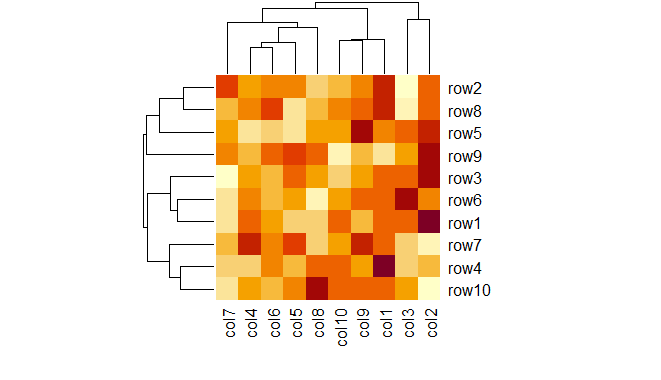 Heatmap in R Programming
2. Create heatmap in R using colorRampPalette
In this example, heat map is drawn by using colorRampPalette to merge two different colors.
r set.seed(110) data <- matrix(rnorm(100, 0, 5), nrow = 10, ncol = 10) colnames(data) <- paste0("col", 1:10) rownames(data) <- paste0("row", 1:10) my_colors <- colorRampPalette(c("cyan", "darkgreen")) heatmap(data, col = my_colors(100)) Output:
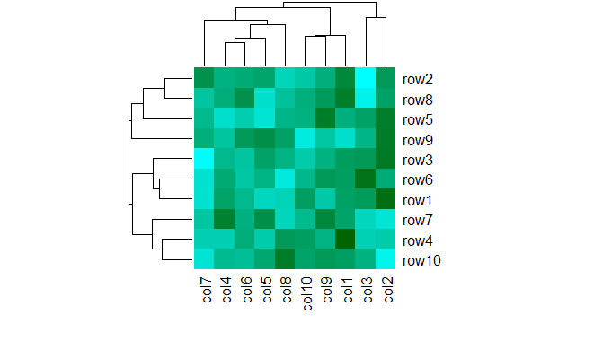 Heatmap in R Programming
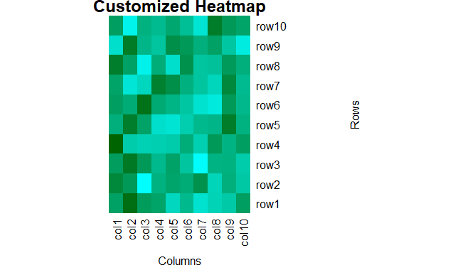
3. Adding Title and Axis Labels to the Heatmap
In this example we give the title of the heatmap using the main argument and the xlab ,ylab arguments are used to label the x and y axes, respectively.
R set.seed(110) data <- matrix(rnorm(100, 0, 5), nrow = 10, ncol = 10) colnames(data) <- paste0("col", 1:10) rownames(data) <- paste0("row", 1:10) my_colors <- colorRampPalette(c("cyan", "darkgreen")) heatmap(data, col = my_colors(100), main = "Customized Heatmap", xlab = "Columns", ylab = "Rows") Output:
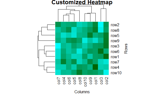 Heatmap in R Programming
4. Margins Around the Heatmap Plot
In this example we plot a heatmap with specified margins around the plot using the margins argument. Here the first value (5) controls the bottom margin and the second value (10) controls the right margin.
R set.seed(110) data <- matrix(rnorm(100, 0, 5), nrow = 10, ncol = 10) colnames(data) <- paste0("col", 1:10) rownames(data) <- paste0("row", 1:10) my_colors <- colorRampPalette(c("cyan", "darkgreen")) heatmap(data, col = my_colors(100), main = "Customized Heatmap", xlab = "Columns", ylab = "Rows", margins = c(5, 10)) Output:
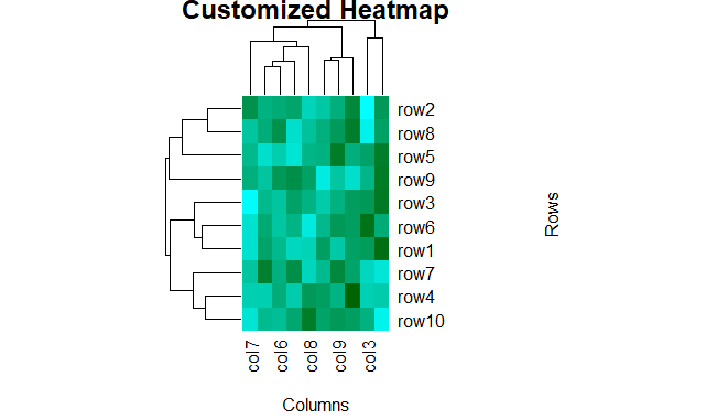 Heatmap in R Programming
5. Heatmap in R without Dendrogram
In this example we plot a heatmap without dendrograms by setting Colv = NA and Rowv = NA, which removes the hierarchical clustering and dendrogram from both rows and columns.
R set.seed(110) data <- matrix(rnorm(100, 0, 5), nrow = 10, ncol = 10) colnames(data) <- paste0("col", 1:10) rownames(data) <- paste0("row", 1:10) my_colors <- colorRampPalette(c("cyan", "darkgreen")) heatmap(data, col = my_colors(100), main = "Customized Heatmap", xlab = "Columns", ylab = "Rows", margins = c(5, 10), Colv = NA, Rowv = NA) Output:
 Heatmap in R Programming
 Similar Reads
Create Dot Charts in R Programming - dotchart () Function dotchart() function in R Language is used to create a dot chart of the specified data. A dot chart is defined as a plot which is used to draw a Cleveland dot plot. Syntax: dotchart(x, labels = NULL, groups = NULL, gcolor = par("fg"), color = par("fg")) Parameters: x: it is defined as numeric vector
2 min read
Create a Plot Matrix of Scatterplots in R Programming - pairs() Function pairs() function in R language is used to return a plot matrix, consisting of scatter plots corresponding to each data frame. R - Create Plot Matrix of Scatterplots Syntax: pairs(data) Parameters: data: It is defined as  value of pairs Plot. Returns: Color, Labels, Panels, and by Group in pairs plo
2 min read
Convert a Data Frame into a Molten Form in R Programming - melt() Function function in R Language is used to combine multiple columns of s Data Frame into a single column. Syntax: melt(x, na.rm, value.name) Parameters: x: data to be melted na.rm: Boolean value to remove NA value.name: Setting column names Example 1: Python3 1== # R program to reshape data frame # Loading l
2 min read
Create Heatmap in R Using ggplot2 A heatmap depicts the relationship between two attributes of a data frame as a color-coded tile. A heatmap produces a grid with multiple attributes of the data frame, representing the relationship between the two attributes taken at a time. In both data analysis and visualization, heatmaps are a com
5 min read
How to Create Correlation Heatmap in R In this article let's check out how to plot a Correlation Heatmap in R Programming Language. Analyzing data usually involves a detailed analysis of each feature and how it's correlated with each other. It's essential to find the strength of the relationship between each feature or in other words how
6 min read