What is Color Theory? - For Beginners
Last Updated : 01 Oct, 2024
Color theory is the science and art of using color to its fullest potential in various visual and practical applications. It not only enhances aesthetic appeal but also influences mood and psychological responses. This guide starts by exploring the color wheel, the cornerstone of color theory, which illustrates the relationships between primary, secondary, and tertiary colors.
You'll learn how to mix colors to achieve harmony and contrast, and understand the impact of complementary and opposite colors. Ideal for anyone from fashion enthusiasts to graphic designers, this introduction ensures you grasp the basics of color usage, setting the stage for more advanced color applications in any creative endeavor.
 Color Theory
What is Color Theory?
Color theory is the study of how colors interact with each other and how they can be combined to create visually pleasing designs. It is both a science and an art, explaining the relationships between colors, how they can be mixed or contrasted, and the psychological effects they have on people. Color theory helps guide designers in choosing color schemes that enhance aesthetics, evoke emotions, and improve visual communication. The color wheel is a central tool in color theory, illustrating how primary, secondary, and tertiary colors relate to one another.
Color Wheel and Theory
Color Wheel is a great tool for understanding the basics of color theory. This tool can help to visualize relationships between colors in a standard, schematic way. It makes understanding colors and their relations with each other, like how they are co related to each other and how two or three colors can be combined with each other.
Types of Colors in Color wheel
The color circle is basically made with the formation of primary, secondary and tertiary colors.
1. Primary Colors
The primary are those color which can not be formed by mixing any two or three colors. The three primary colors are red, yellow, and blue.
2. Secondary Colors
Secondary colors are the colors that are formed by mixing any two primary colors. By mixing primary colors we can get Orange, Green, and Purple.
3. Tertiary Colors
A primary color and a secondary color are mixed to generate tertiary colors. More precisely, a tertiary color is created when a primary color mixes with a secondary color that is adjacent to it in the color wheel.
.webp) Primary Secondary and Tertiary Colors
Primary Secondary and Tertiary Colors12 Colors of Color Wheel
The 12 basic colors are essential for understanding color theory and are widely used in design and art. These colors include three primary colors: red, blue, and yellow.
These primary colors can be mixed to create the three secondary colors: green, orange, and purple. When you mix a primary color with a secondary color, you get the six tertiary colors: red-orange, yellow-orange, yellow-green, blue-green, blue-purple, and red-purple. Knowing these 12 basic colors helps you create beautiful and harmonious designs, making it easier to choose color schemes that look great together.
.webp) Color Chart
Color ChartHow Does Color Theory Work?
Color theory explains how colors interact with each other and how they can be combined to create pleasing designs. It involves understanding the color wheel, which shows the relationship between primary, secondary, and tertiary colors. Primary colors (red, blue, and yellow) can be mixed to create secondary colors (green, orange, and purple). Tertiary colors are made by mixing primary and secondary colors. Color theory also includes concepts like complementary colors, which are opposite each other on the color wheel and create high contrast, and analogous colors, which are next to each other and create harmony. By learning these basics, you can use color more effectively in your designs.
What is Hue, Saturation, and Value of a Color?
When we talk about colors, we often hear terms like hue, saturation, and value. These three aspects help us describe and understand colors better.
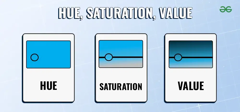 Hue, Saturation, and Value
- Hue is another word for color. All of the primary and secondary, and tertiary colors are hues.
- Saturation is basically how pure and intense the color seems. Saturation denotes the percentage of gray in a color.
- Value is the basically the amount of brightness or darkness we see in the color.
What are Tints, Shades and Tones of Colors
In color theory, tints, shades, and tones refer to different variations of colors that we see. Primary, secondary, and tertiary colors are known as pure colors.
 Tints, Shade, and Tone
- When we add white color to pure color then tints are formed.
- Shade is the color that we get by adding black to any pure color.
- By adding black and white to pure colors one can get tones. Tones are also known as Saturation.
To read more about different color theory terminologies visit Mastering Color Theory.
Understanding Color Harmony
Creating harmony between colors means choosing shades that look good together and create a pleasing effect. To achieve this, you can use a color wheel as a guide. Colors that are next to each other on the wheel, like blue and green, often work well together and create a calming look. Alternatively, colors opposite each other, like red and green, can create a vibrant and eye-catching contrast. Experimenting with different combinations can help you find the perfect balance for your design or artwork.
These are also known as color schemes. There are four main types of color schemes.
 Color Harmony
1. Monochrome colors:
It contains different hues, saturations, and tints of the same color.
Monochrome Color Scheme Example:
Red and all its tints are the monochrome scheme of the color Red.
2. Complementary Colors:
Two colors from opposite sides of the color wheel are the base of complementary color schemes.
Complementary Color Scheme Example:
- Red and Green
- Blue and Orange
- Yellow and Purple
3. Analogous Colors:
On the color wheel, adjacent colors are referred to as analogous colors. This type of palette can look very beautiful because the colors fit together so nicely.
Analogous Color Scheme Example:
- Red, Orange, & Yellow
- Deep, Blue Indigo, & Violet
- Green, Lime Green, & Yellow
4. Triadic Colors:
Triadic Scheme is made by using three colors that are at the points of a triangle drawn within the color wheel.
Triadic Color Scheme Example:
- Green, Orange, & Purple
- Red, Yellow, & Blue
Here are Some Key Tips to apply Color Schemes:
- Study the cultural background
- Understand color theory
- Use contrast effectively
- Try to practice frequently used color connections for communicating brand messaging and values
- Make a color palette
To read more about color schemes and selections visit Color Schemes.
Color Psychology and Design Applications
Colors can convey specific meanings and emotions which can be in a positive or negative manner depending on how it is being used. Colors have the ultimate strength to convey what your business is about.
 Color Meanings
Colors can convey different emotions and meanings, which is important to understand when creating designs. Knowing what colors represent what can help you choose the right colors for your designs. Here’s a simple guide to the meanings of common colors:
Warm Colors in Color Theory
These create an energetic effect on the visitor, but when used alone it can be overwhelming. So it is always suggested to mix them with cool and neutral colors for balance.
- Red: Promotes Power, Importance and Youth.
Red is the color which denotes passion and power, it is the color that is very eye catchy and that is why it attracts the most attention, and that is why it is commonly used for warning signals and to highlight things so that it get noticed easily. - Orange: Promotes Friendliness, Energy and Uniqueness.
Orange is a mixture of its two side colors on the color wheel, red and yellow. Orange is the most muted warm color, and is uniquely versatile. - Yellow: Promotes Youthful, Lively, Energy, Freshness and Optimistic.
Yellow is one of the more versatile colors. Yellow gives mixed emotions like negative feelings: caution, criticism, laziness, and jealousy and Darker shades of yellow signifies impression of antiquity, timelessness, wisdom, and curiosity.
Cool Colors in Color Theory
These have a calming effect on the viewer, and this is the reason why cool colors are the most common colors used on websites.
- Green: Promotes Growth, Stability, Financial Themes, Environmental Themes and Freshness.
Green comes between warm and cool colors. It gives a very balanced and stable aesthetic. On the other hand, green is a symbol of money, showing greed or jealousy. - Blue: Promotes Calm, Trust, Competence, Peace, Logic and Reliability.
Blue is a soothing, peaceful and calming color. Social media sites like Twitter and Facebook use light and medium shades, while corporate websites prefer dark shades tones of strength and reliability. - Purple: Promotes Luxury, Romance (lighter shades) and Mystery (darker shades).
Purple is the color of luxury, royalty and sophistication and wealth. Purples suggest lavishness and because of that most luxury goods and fashion brands opt for this color, even cadbury also uses purple for its packaging. On the other hand Lighter shades like lavender (with pink hues) are considered romantic.
Neutral Colors in Color Theory
These are great to mix with warm or cool colors and they are often used to tone down primary colors and create balance in web design.
- Black: Promotes Power, Edginess and Sophistication.
The strongest of the neutral colors. It is not part of the color wheel but can mostly be seen in almost all the websites. It also depicts grief, mourning, and sorrow so it must be used wisely. - White: Promotes Cleanliness, Virtue and Simplicity.
White is also not a part of the color wheel and mostly associated with virtue, purity, and innocence. Whites are mostly used as a background color in websites which prefer minimalistic and simple approaches. - Gray: Promotes Neutrality, Formality and Balance.
Gray is a versatile neutral color which conveys professionalism and it is also very popular for traditional and formal choices. It is often used for texts, borders and subtle elements. - Beige: Promotes Calmness and Relaxation.
Beige is the combination of yellow, brown, and gray. As most beige colors are very light, Designers tend to use them as background colors.
To read more about the Color Symbolism visit Color Meaning.
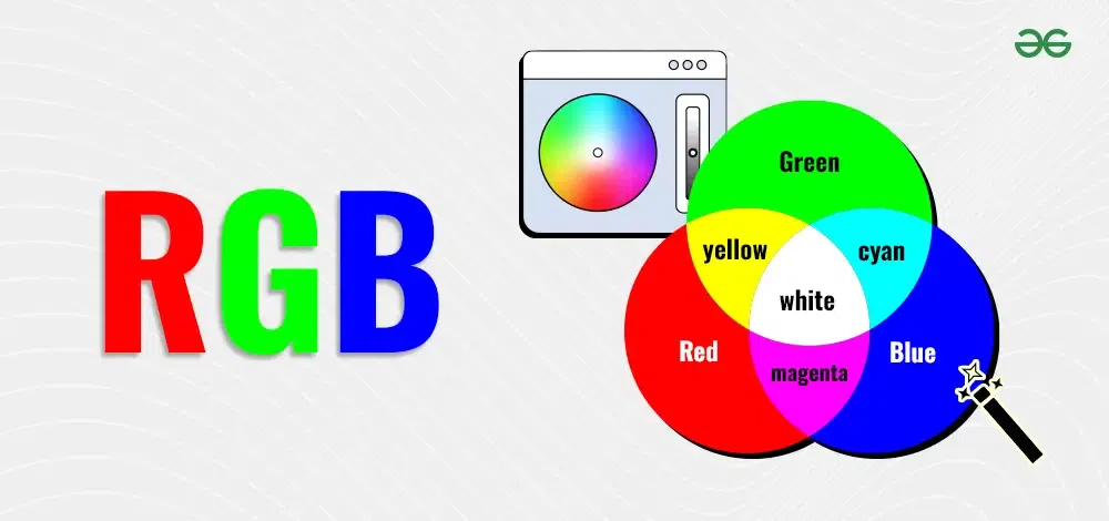
Color Models (RGB and CMYK)
Color models are frameworks that describe the way colors can be represented as groups of numbers, typically as three or four values or color components. The most common color models you might have heard of include RGB (Red, Green, Blue) and CMYK (Cyan, Magenta, Yellow, Key/Black).
Each model has a specific purpose: RGB is used mainly for digital displays like computer monitors and TVs, while CMYK is used in color printing. By understanding these models, artists and designers can create and reproduce colors accurately in different mediums. Another popular model is the HSB (Hue, Saturation, Brightness), which is often used by artists to pick colors based on their visual characteristics.
CMYK
CMYK stands for Cyan, Magenta, Yellow, and Key (Black). It's a color model used in printing. Printers mix these four ink colors to create a wide range of other colors. Each letter in CMYK represents one of the main colors used. Cyan is a shade of blue, Magenta is a shade of pink, Yellow is the yellow ink, and Key refers to the black ink used to add depth and detail. By combining different amounts of these inks, printers can produce vibrant and accurate colors on paper.
 CMYK
CMYKRGB
RGB stands for Red, Green, and Blue. It is a color model used for digital screens like TVs, computers, and smartphones. In the RGB model, colors are created by mixing different amounts of red, green, and blue light. When combined in various ways, these three colors can produce millions of different colors. RGB is essential for displaying images and graphics on digital devices, making it a key concept in digital design and photography.
 RGB
RGBTo learn more about Color Models visit Color Models
Following are the best examples of color combinations:
Here are some great examples of color combinations that look good and also create certain emotions and feelings. Here are a few of these combinations
1. Midnight Blue and Peach:
 Midnight Blue and Peach
2. Moss Green and Tan:
.jpg) Moss Green and Tan
Moss Green and TanTo see more Color Combinations visit Color Combinations.
Practical Tips for Using Color Theory
- Study cultural background and color meanings
- Use contrast effectively to highlight important elements.
- Create a balanced color palette that complements your design.
Conclusion
In conclusion, understanding color theory, from the coloring wheel to color harmony, is essential for creating visually appealing designs that communicate effectively. Whether you are exploring color theory for beginners or mastering color theory for artists, the knowledge of color theory and color wheel interactions allows you to create balanced and impactful designs. By mastering concepts like color wheel colors, color wheel opposite colors, and color psychology and theory, designers can use basic color theory to enhance their work, whether in fashion, graphic design, or any creative field.
Applying this color knowledge will empower you to make informed design choices, using the 12 colors of the color wheel and contrasting color wheel elements to convey emotions, highlight key elements, and create harmonious designs across various platforms.
Similar Reads
What is User Interface (UI) Design? User Interface (UI) Design shapes the user's digital experience. From websites to mobile apps, UI design encompasses the visual and interactive elements that users engage with. A well-crafted UI not only enhances usability but also communicates the brand's identity and values. In this article, we de
7 min read
What is UI Design ? UI Design, or User Interface Design, is all about creating the look and feel of a website or app. It focuses on how things look on the screen and how users interact with them. A good UI design makes a product not only attractive but also easy to use. In this article, we will explore what UI Design i
10 min read
Principles of Design and How to Use Them The principles of design are guidelines that help create visually appealing and effective designs. These principles include balance, contrast, emphasis, movement, pattern, rhythm, and unity. By understanding and applying these principles, designers can make their work more engaging and easier to und
7 min read
Color Theory
What is Color Theory? - For BeginnersColor theory is the science and art of using color to its fullest potential in various visual and practical applications. It not only enhances aesthetic appeal but also influences mood and psychological responses. This guide starts by exploring the color wheel, the cornerstone of color theory, which
12 min read
Mastering Color Theory: Advanced Color Theory InsightsAdvanced Color Theory is the study of using colors to convey an emotion, create a visual effect, or change human perception is known as Color Theory. Color theory is all about using colors to convey the right message. But how can we use color theory to our advantage? And how does color theory correl
7 min read
What are Color Schemes | Color Theory, Color Wheel, and It's TypesColor schemes are essential in design, helping to create visual harmony and convey specific emotions. They play a crucial role in various fields, including graphic design, web design, interior design, and fashion. By understanding color theory and the color wheel, designers can create appealing and
9 min read
Color Meaning | The Concept of Using Color SymbolismColors are everywhere, shaping our world and influencing how we feel and act. We've been giving meanings to different colors for ages. Whether it's in art, design, or psychology, understanding what colors mean can tell us a lot about ourselves and the world around us.In this article, we will talk ab
10 min read
How to Use Colors in Web DesignIn this article, we are going to learn about the Colors that are used in Web Design. Talking about colors, that is an important part of web designing and other aspects too. With the help of a good combination of colors, we can convey our message to the users, that is what a website is all about, wha
7 min read
Why Color Contrast Matters in UI/UX Design ?Color contrast is one of the many visual design principles in UI/UX design. Here we are talking about contrast in the context of visual design and it is defined as a difference between two or more elements in a composition. But why does it matter so much? Why should you care about contrast during yo
6 min read
Importance of Color Code Concepts in UI/UX DesignIn this article, we will learn to efficiently use color codes in UI/UX to improve user experience. What is a Color Code?A color code is a system used to represent and specify colors in various formats, typically in digital or graphic design. Example: #FF0000 represents the color red. Color Code Conc
5 min read
Color Element in Web DesignColor theory is a set of guidelines that artists and designers use to communicate different ideas and feelings to audiences. Colors give an essence and live to whatever we see. They create a lot of impact on users as we have already discussed that colors evoke emotions. Colors may create motion and
4 min read
Hex Color CodesHex Color or Hex Color Code is one of the most used color code schemes. It stands for Hexadecimal Color Codes. While making a design Hex Color Codes are one of the best ways to use a color. In this article, we will discuss What are Hex Color Codes. Why Should We Use Hex Color Codes? Some points to k
3 min read
Typography
What is Typography?What is typography? It's an art and technique that breathes life into written words. Typography encompasses everything from the design of a logo's typeface to the style of text on a T-shirt. It involves choosing typefaces and fonts, designing text layouts, and modifying font styles to enhance readab
12 min read
How to Create a Typographic Hierarchy in Web Design ?Typography simply is a technique in user interface design to create readable, appealing, attractive, and easy-to-eye text for users to read. Typography plays an integral role in any website's design. Other than the visual elements, text is the most important form to communicate with the users, somet
8 min read
How to Choose the Right Font as a Designer ?A website's font choice is crucial to its overall look. Word is the most crucial medium for user communication, second only to visual aspects; in many cases, the word is even more significant than the graphics themselves. To choose the right font for your design we need to keep a few things in mind,
6 min read
Typeface vs Font: What's the DifferenceIn the world of digital design, the terms “typeface†and “font†are often used interchangeably. However, they have different meanings that every graphic designer, web developer, and digital marketing professional should understand. This article will help you understand the differences between font a
8 min read
Visual Design
What is Visual Design?Visual design is all about making things look good and easy to understand. It uses colors, typography, images, and layout to communicate messages effectively. As one of the most important fields in digital design, visual design focuses on aesthetics and functionality, making websites, apps, and adve
8 min read
Visual Elements of Web DesignVisual elements are the basic parts that make up any design. These include lines, shapes, colors, textures, typography, space, and images. When used together, these elements help create designs that look good and communicate messages clearly. Understanding these visual elements is important for anyo
8 min read
What Is a Visual Designer ? How to Become One - Roles and SkillsA visual designer is a creative professional who specializes in making digital products visually appealing and easy to use. They combine artistic skills with a deep understanding of design principles to create engaging experiences for websites, apps, and other digital platforms. Visual designers wor
10 min read
12 Principles of Visual Design That Every UI Designer Should KnowDesigns create impact using visuals, placed in the order of their importance. A good design is something that has a balance of all the elements occurring in a sequence in an expected manner in front of the user so as to give a sense of familiarity. Visual principles make each and every piece appear
11 min read
How to Create Buttons in Visual Design?Buttons are an integral part of an interface. They are used to help users interact with the interface by giving input commands. They are used to navigate through a website, submit information on a website, redirect to another web page, interact with the website features, etc. Making these buttons cr
3 min read
Significance of Icons in User Interface DesignIcons are an important part of user interfaces, which are used in expressing objects, actions, and ideas. They are used to communicate the core idea and intent of a product or action. So, they bring a lot of benefits to user interfaces. Table of ContentWhat are the Icons Used for?Types of IconsKey P
5 min read
How to Use Images for Efficient Web Design ?Images are an important part of web design, Images can easily explain what text cannot. Using images in an efficient manner improves the UI design, users can understand it faster but it will affect webpage performance if not used efficiently. So in this article, we will understand how to use images
6 min read
Negative Space or White Space in Design? Negative space, also known as white space, is the empty area between design elements like text, images, and buttons. This isn't just empty space; it's an essential part of the design that helps to define everything else around it, making the overall design easier to understand and more attractive. W
7 min read
Components Library
Types of Design
What is Web Design?What is Web Design?Web Design is the field of Designing Website interfaces. It deals with the looks part of the website rather than the coding part. Designing how the interface will look is called User Interface(UI) Design and Designing the flow of the user on the website, how the user will navigate
4 min read
What is Interaction Design?Interaction design is about making digital products easy and enjoyable to use. It focuses on how people interact with websites, apps, and other digital tools, ensuring these interactions are smooth and intuitive. In this article, we'll explain what interaction design is, why it matters, and how it h
6 min read
E-commerce Design | Importance, Principles and BenefitsE-commerce design is about making online shopping sites easy to use and visually appealing, so people enjoy buying things online. It involves how the website looks, how easy it is to find products, and how simple the buying process is. Shopping for goods from a store can be hectic for customers. Loo
4 min read
One-Page Web DesignUsing websites and navigating through different pages to look for certain things, everyone has done that. But what if the content isn't that much but what if the content isn't that much but still someone has to navigate through pages to look at it? It becomes time-consuming and ruins the experience
3 min read
Corporate Web Design | Importance, Principles and BenefitsThere are many kinds of website designs, which are made according to their needs. Companies use websites to mark their online presence and expand and promote their business. But how should such websites be designed to attract new customers and retain the older ones? In this article, we will discuss
3 min read
Portfolio Design - A Complete OverviewPortfolio design is not just about showcasing a collection of works; it's a strategic craft that combines aesthetics with functionality, offering a compelling narrative about one's expertise, style, and personality. Whether it's for a graphic designer, photographer, or architect, the design of a por
3 min read
Landing Page Design | Types of Landing Pages and BenefitsCrafting an effective landing page design is paramount in today's digital landscape, where the battle for user attention is relentless. A well-designed landing page can be the difference between a fleeting visitor and a converted customer. It serves as the virtual storefront, the first impression th
4 min read
Illustrative Design | Key Benifits and things to Avoide in WebsiteLooking at plain Websites can become boring for users after a certain time, and can also cause them to leave the website. This is why custom-made illustrations and other visual elements are used on many websites. These websites are called Illustrative Websites. Designing part of these websites is ve
4 min read
SEO-Friendly Web DesignWebsites Designed while keeping the user needs into consideration are good. But this alone doesn't determine their rank on SERPs. Designing websites should also include SEO practices to make an SEO-optimized website. Considering Users' needs and SERP rankings both help websites rank higher on SERPs.
6 min read
UI Design Approaches
Minimalism in Web DesignMinimalism in web design focuses on simplicity and clarity, using only essential elements to create clean and effective websites. This approach avoids clutter and distractions, making it easier for users to navigate and find information. In this article, we'll explore the principles of minimalism in
5 min read
What is Flat Design?Flat Design is a popular design trend characterized by simplicity and minimalism. This style uses clean, two-dimensional elements without any shadows, gradients, or textures, giving it a sleek and modern look. Flat Design focuses on usability and clarity, making it easy for users to interact with di
6 min read
What Is Skeuomorphism?Skeuomorphism is a word derived from two Greek terms "skeuos" (meaning container or a tool) and "morphē " (meaning shape), it's a concept of implementing real-life elements into the digital world to create a sense of familiarity or resemble a real-life object in the digital world. What Is Skeuomorph
5 min read
Difference Between Skeuomorphism and Flat Design in UISkeuomorphic designs were used to rule the UI design system in earlier days. Today how outdated it may look but this design has made the user familiar with the ways real-world elements are incorporated in interfaces because of which a paradigm shift from skeuomorphism to flat designs happened easily
5 min read
What is Material Design?In UI/UX design, we often come across the term Material design, hear professional UI/UX designers talk about Material design, and think it is some fancy word only for designers with years and years of experience. In this article, we will try to explain what Material design is in simpler terms along
6 min read
Neuromorphic Design - Blurring the Lines Between UI and RealityIn the era of UI/UX design, brands want to create a more comfortable and natural user experience. To do so they take inspiration from the environment and how a human interacts with it. Today many big brands and institutions are investing a huge amount of money just to understand the human brain and
8 min read
Atomic DesignAtomic design is a method used in web and app development to create consistent and reusable design components called atoms. Instead of creating a whole website or app all at once, you break it down into smaller pieces, such as buttons, forms, and menus. These smaller pieces, or atoms, can be combine
5 min read