Bootstrap 4 provides classes to style images responsively, including responsive images that automatically adjust the size based on screen width, image shapes such as rounded or circular, and image thumbnails with optional borders and captions, facilitating flexible and attractive image layouts.
The different classes available in Bootstrap for images are explained below:
Responsive Images
The .img-fluid class is used within the <img> tag to create the responsive image. The responsive image is used to adjust the image automatically to the specified box.
Syntax:
<img src="image_source" class="img-fluid" ...>
Example: In this example we demonstrates Bootstrap 4's responsive image feature, using the 'img-fluid' class to ensure the image scales appropriately based on screen size.
HTML <!DOCTYPE html> <html lang="en"> <head> <title>Bootstrap Images</title> <meta charset="utf-8"> <meta name="viewport" content="width=device-width, initial-scale=1"> <link rel="stylesheet" href= "https://maxcdn.bootstrapcdn.com/bootstrap/4.3.1/css/bootstrap.min.css"> <script src= "https://ajax.googleapis.com/ajax/libs/jquery/3.3.1/jquery.min.js"> </script> <script src= "https://cdnjs.cloudflare.com/ajax/libs/popper.js/1.14.7/umd/popper.min.js"> </script> <script src= "https://maxcdn.bootstrapcdn.com/bootstrap/4.3.1/js/bootstrap.min.js"> </script> <style> .custom-img { width: 600px !important; height: 180px !important; } </style> </head> <body style="text-align:center;"> <div class="container"> <h2>Responsive Image</h2> <img class="img-fluid custom-img" src= "https://media.geeksforgeeks.org/wp-content/uploads/20240611121643/responsive-image.png" alt="Responsive image" /> </div> </body> </html> Output:

Rounded Corners Image
The .rounded class is used to create a rounded corner image. This class is used with <img> tag.
Syntax:
<img src="image_source" class="rounded" ...>
Example: In this example we use Bootstrap 4's 'rounded' class to create a rounded corner image, providing a visually appealing presentation for the image element.
HTML <!DOCTYPE html> <html lang="en"> <head> <title>Bootstrap Images</title> <meta charset="utf-8"> <meta name="viewport" content="width=device-width, initial-scale=1"> <link rel="stylesheet" href= "https://maxcdn.bootstrapcdn.com/bootstrap/4.3.1/css/bootstrap.min.css"> <script src= "https://ajax.googleapis.com/ajax/libs/jquery/3.3.1/jquery.min.js"> </script> <script src= "https://cdnjs.cloudflare.com/ajax/libs/popper.js/1.14.7/umd/popper.min.js"> </script> <script src= "https://maxcdn.bootstrapcdn.com/bootstrap/4.3.1/js/bootstrap.min.js"> </script> </head> <body style="text-align:center;"> <div class="container"> <h2>Rounded Corner Image</h2> <img class="rounded" src= "https://media.geeksforgeeks.org/wp-content/uploads/20240611122859/ responsiveImageOutput.png" alt="Responsive image" width="367" height="340" /> </div> </body> </html>
Output:
 Rounded Corner Image Example Output
Circle Image
The .rounded-circle class is used to create the circle shape image.
Syntax:
<img src="image_source" class="rounded-circle" ...>
Example: In this example we are using Bootstrap 4's rounded-circle class to render a circular image, offering a visually distinct presentation for the image element.
HTML <!DOCTYPE html> <html lang="en"> <head> <title>Bootstrap Images</title> <meta charset="utf-8"> <meta name="viewport" content="width=device-width, initial-scale=1"> <link rel="stylesheet" href= "https://maxcdn.bootstrapcdn.com/bootstrap/4.3.1/css/bootstrap.min.css"> <script src= "https://ajax.googleapis.com/ajax/libs/jquery/3.3.1/jquery.min.js"> </script> <script src= "https://cdnjs.cloudflare.com/ajax/libs/popper.js/1.14.7/umd/popper.min.js"> </script> <script src= "https://maxcdn.bootstrapcdn.com/bootstrap/4.3.1/js/bootstrap.min.js"> </script> </head> <body style="text-align:center;"> <div class="container"> <h2>Circle Image</h2> <img class="rounded-circle" src= "https://media.geeksforgeeks.org/wp-content/uploads/20240611122859/ responsiveImageOutput.png" alt="Responsive image" width="467" height="340" /> </div> </body> </html>
Output:
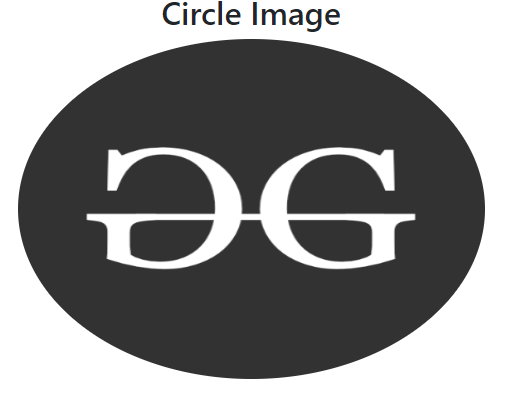 Circle Image Example output
Thumbnail Image
The .img-thumbnail class is used to create a thumbnail (bordered) image.
Syntax:
<img src="image_source" class="img-thumbnail" ...>
Example: In this example we are using Bootstrap 4's img-thumbnail class to display a thumbnail image, providing a bordered and visually highlighted presentation for the image element.
HTML <!DOCTYPE html> <html lang="en"> <head> <title>Bootstrap Images</title> <meta charset="utf-8"> <meta name="viewport" content="width=device-width, initial-scale=1"> <link rel="stylesheet" href= "https://maxcdn.bootstrapcdn.com/bootstrap/4.3.1/css/bootstrap.min.css"> <script src= "https://ajax.googleapis.com/ajax/libs/jquery/3.3.1/jquery.min.js"> </script> <script src= "https://cdnjs.cloudflare.com/ajax/libs/popper.js/1.14.7/umd/popper.min.js"> </script> <script src= "https://maxcdn.bootstrapcdn.com/bootstrap/4.3.1/js/bootstrap.min.js"> </script> </head> <body style="text-align:center;"> <div class="container"> <h2>Thumbnail Image</h2> <img class="img-thumbnail" src= "https://media.geeksforgeeks.org/wp-content/uploads/20240611123517/image.png" alt="Responsive image" width="467" height="340" /> </div> </body> </html>
Output:
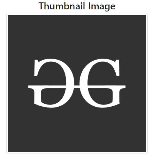 Thumbnail Image Example Output
Aligning Image
The .float-left and .float-right class is used to set the left and right alignment of the image.
Syntax:
<img src="image_source" class="float-left/float-right" ...>
Example: In this example we are using Bootstrap 4's float-left and float-right classes to align images to the left and right sides, respectively, within the container.
HTML <!DOCTYPE html> <html lang="en"> <head> <title>Bootstrap Images</title> <meta charset="utf-8"> <meta name="viewport" content="width=device-width, initial-scale=1"> <link rel="stylesheet" href= "https://maxcdn.bootstrapcdn.com/bootstrap/4.3.1/css/bootstrap.min.css"> <script src= "https://ajax.googleapis.com/ajax/libs/jquery/3.3.1/jquery.min.js"> </script> <script src= "https://cdnjs.cloudflare.com/ajax/libs/popper.js/1.14.7/umd/popper.min.js"> </script> <script src= "https://maxcdn.bootstrapcdn.com/bootstrap/4.3.1/js/bootstrap.min.js"> </script> </head> <body style="text-align:center;"> <div class="container"> <h2>Aligning Image</h2> <!-- Bootstrap float-left class --> <img class="float-left" src= "https://media.geeksforgeeks.org/wp-content/uploads/20240611123517/image.png" alt="Responsive image" width="250" height="250" /> <!-- Bootstrap float-right class --> <img class="float-right" src= "https://media.geeksforgeeks.org/wp-content/uploads/20240611123517/image.png" alt="Responsive image" width="250" height="250" /> </div> </body> </html>
Output:
 Aligning Image Example Output
Centered Image
The .mx-auto (margin:auto) and .d-block (display:block) classes are used to set the image into center.
Syntax:
<img src="image_source" class="mx-auto d-block" ...>
Example: In this example we are using Bootstrap 4's mx-auto and d-block classes to horizontally center an image within the container.
HTML <!DOCTYPE html> <html lang="en"> <head> <title>Bootstrap Images</title> <meta charset="utf-8"> <meta name="viewport" content="width=device-width, initial-scale=1"> <link rel="stylesheet" href= "https://maxcdn.bootstrapcdn.com/bootstrap/4.3.1/css/bootstrap.min.css"> <script src= "https://ajax.googleapis.com/ajax/libs/jquery/3.3.1/jquery.min.js"> </script> <script src= "https://cdnjs.cloudflare.com/ajax/libs/popper.js/1.14.7/umd/popper.min.js"> </script> <script src= "https://maxcdn.bootstrapcdn.com/bootstrap/4.3.1/js/bootstrap.min.js"> </script> </head> <body> <div class="container"> <h2 style="text-align:center;">Centered Image</h2> <img class="mx-auto d-block" src= "https://media.geeksforgeeks.org/wp-content/uploads/20240611123517/image.png" alt="Responsive image" /> </div> </body> </html>
Output:
 Centered Image Example Output
 Similar Reads
Bootstrap 4 Tutorial Bootstrap 4 is an open-source framework for creating responsive web applications. It is the most popular CSS framework for creating mobile-first websites. It is free to use we can directly integrate Bootstrap 4 into our project using CDN Links or with npm. Bootstrap 4 Tutorial is designed to help be
3 min read
Bootstrap 4 Introduction Bootstrap is a free and open-source tool collection for creating responsive websites and web applications. It is the most popular HTML, CSS, and JavaScript framework for developing responsive, mobile-first websites. It solves many problems which we had once, one of which is the cross-browser compati
3 min read
Layout
Content
Bootstrap 4 | TypographyTypography is a feature of Bootstrap for styling and formatting the text content. It is used to create customized headings, inline subheadings, lists, paragraphs, aligning, adding more design-oriented font styles, and much more. Bootstrap support global settings for the font stack, Headings and Link
3 min read
Bootstrap 4 ImagesBootstrap 4 provides classes to style images responsively, including responsive images that automatically adjust the size based on screen width, image shapes such as rounded or circular, and image thumbnails with optional borders and captions, facilitating flexible and attractive image layouts. The
4 min read
Bootstrap 4 | TablesBootstrap provides a series of classes that can be used to apply various styling to the tables such as changing the heading appearance, making the rows stripped, adding or removing borders, making rows hoverable, etc. Bootstrap also provides classes for making tables responsive. Simple Table: The .t
9 min read
Bootstrap | figure class with ExamplesA figure is used when one needs to display a piece of content, generally images with an optional caption. The figure class in Bootstrap is used to add styling to the default figure elements. The base .figure class is used to indicate a figure element. The .figure-img is used to indicate the image us
1 min read
Components
Bootstrap 4 | AlertsWe often see certain alerts on some websites before or after completing an action. These alert messages are highlighted texts that are important to take into consideration while performing a process. Bootstrap allows showing these alert messages on the website using predefined classes. The .alert cl
3 min read
Bootstrap 4 | BadgesThe .badge class is used to add additional information to the content. For example, some websites associate a number of notifications to the link. The notification number is seen when logged in to a particular website which tells the numbers of news or notifications to see by clicking it.Example: HT
3 min read
Bootstrap 4 | ButtonsBootstrap provides different classes that can be used with different tags, such as <button>, <a>, <input>, and <label> to apply custom button styles. Bootstrap also provides classes that can be used for changing the state and size of buttons. Also, it provides classes for app
5 min read
Bootstrap 4 | Button GroupsBootstrap offers classes which allow to group buttons along the same line, horizontally or vertically. The buttons to be grouped are nested inside a <div> element with the class .btn-group. Horizontally arranged button groups: The .btn-group class is used to create horizontally arranged button
4 min read
Bootstrap 4 | CardsA Bootstrap card is a flexible box containing some padding around the content. It includes the options for headers and footers, color, content, and powerful display options. It replaces the use of panels, wells, and thumbnails. It can be used in a single container called card. Basic Card: The .card
7 min read
Bootstrap 4 CarouselThe Bootstrap Carousel is used to create an image slide show for the webpage to make it look more attractive. It can be included in the webpage using bootstrap.js or bootstrap.min.js. Carousels are not supported properly in Internet Explorer, this is because they use CSS3 transitions and animations
2 min read
Bootstrap 4 | CollapseBootstrap 4 offers different classes for creating collapsible elements. A collapsible element is used to hide or show a large amount of content. When clicking a button it targets a collapsible element, the class transition takes place as follows:Â Â .collapse: It hides the content..collapsing: It appl
5 min read
Bootstrap 4 | DropdownsDropdowns are one of the most important parts of an interactive website. A dropdown menu is the collection of menu items that allow users to choose a value from the list. The .dropdown class is used to design the drop-down menu. Example: HTML <!DOCTYPE html> <html lang="en">
8 min read
Bootstrap 4 | FormsForm Layout: Bootstrap provides two types of form layout which are listed below: Stacked formInline form Stacked form: The stacked form creates input field and submit button in stacked format. Example: HTML <!DOCTYPE html> <html lang="en"> <head> <title>Bootstrap Fo
5 min read
Bootstrap 4 | Input GroupsInput Groups in Bootstrap are used to extend the default form controls by adding text or buttons on either side of textual inputs, custom file selectors or custom inputs. Basic input groups: The following classes are the base classes that are used to add the groups to either side of the input boxes.
7 min read
Bootstrap 4 | JumbotronBootstrap 4 Jumbotron is a large, prominent container for displaying key content, such as headers or call-to-action messages, with customizable background colors and padding for emphasis. Steps to add jumbotron: Use a jumbotron class inside a div element.Write any text inside the div tag.Close the d
2 min read
Bootstrap 4 | List GroupsList Groups are used to display a series of content in an organized way. Use .list-group and .list-group-item classes to create a list of items. The .list-group class is used with <ul> element and .list-group-item is used with <li> element. Example: HTML <!DOCTYPE html> <html la
4 min read
Bootstrap 4 | ModalIn simple words, the Modal component is a dialog box/popup window that is displayed on top of the current page, once the trigger button is clicked. However, clicking on the modal's backdrop automatically closes the modal. Also, it must be kept in mind that Bootstrap doesn't support nested modals as
5 min read
Bootstrap 4 | NavsNav Menu: The .nav, .nav-item and .nav-link classes are used to create navigation menu. The .nav, .nav-item and .nav-link classes are used with <ul>, <li> and link element respectively. Example: HTML <!DOCTYPE html> <html lang="en"> <head> <title>Nav men
7 min read
Bootstrap 4 Navigation BarA navigation bar is used in every website to make it more user-friendly so that the navigation through the website becomes easy and the user can directly search for the topic of their interest. The navigation bar is placed at the top of the page.Basic Navigation Bar: The .navbar class is used to cre
8 min read
Bootstrap 4 | PaginationPagination is used to enable navigation between pages in a website. The pagination used in Bootstrap has a large block of connected links that are hard to miss and are easily scalable. Basic Pagination: The basic pagination can be specified using the following classes. The .pagination class is used
5 min read
Bootstrap 4 | PopoverThe popover is an attribute of bootstrap that can be used to make any website look more dynamic. Popovers are generally used to display additional information about any element and are displayed on click of mouse pointer over that element.The data-toggle = "popover" attribute is used to create popov
3 min read
Bootstrap 4 | Progress BarsA progress bar is used to display the progress of a process on a computer. A progress bar displays how much of the process is completed and how much is left. You can add a progress bar on a web page using predefined bootstrap classes. Bootstrap provides many types of progress bars.Syntax:Â Â <div c
4 min read
Bootstrap 4 | ScrollspySometimes while designing the website, we include some attractive features which makes website eye-catching. One of the features is Bootstrap scrollspy which target the navigation bar contents automatically on scrolling the area.Create scrollspy: The data-spy="scroll" and data-target=".navbar" attri
4 min read
Bootstrap 4 | TooltipA Tooltip is used to provide interactive textual hints to the user about the element when the mouse pointer moves over. For Example, in the below image GeeksForGeeks is a button and when the user mouse moves over it, the additional information "A computer Science Portal" pops-up will display. Toolti
2 min read
Bootstrap 4 | SpinnersBootstrap provides various classes for creating different styles of "spinner" to display the loading state of projects. These classes are inbuilt with HTML and CSS so no need to write any JavaScript to create them. We can also modify the appearance, size, and placement of the spinners with the class
7 min read
Bootstrap 4 | ToastToast is used to create something like an alert box which is shown for a short time like a couple of seconds when something happens. Like when the user clicks on a button or submits a form and many other actions. .toast: It helps to create a toast.toast-header : It helps to create the toast header.t
3 min read
Utilities
Extend