- Introduction and Installation
- Buttons, Glyphicons, Tables
- Vertical Forms, Horizontal Forms, Inline Forms
- DropDowns and Responsive Tabs
- Progress Bar and Jumbotron
Prerequisites: Web Development Basics and BootStrap (Part-1)
Grid System: In the previous article we had learnt about Bootstrap and its Installation.However, from this article, we are going to start with learning Bootstrap. We are going to talk about the Bootstrap Grid System in this article.
Grid System: Bootstrap Grid System allows up to 12 columns across the page. You can use each of them individually or merge them together for wider columns. You can use all combinations of values summing up to 12. You can use 12 columns each of width 1, or use 4 columns each of width 3 or any other combination.
Grid Classes: The Bootstrap grid system has four classes that can be combined to make more flexible layouts:
- xs (<576px): For Portrait Mobile Phones.
- sm (>=576px): For Landscapes phones
- md (>=768px): For Tablets/Phablets
- lg (>=992px): For Small-sized Desktops/Laptops
- xl (>=1200px): For Larger-sized Desktops/Laptops
Note: Output can be little difference as shown, it depend on your screen size.
Components of Grid System: We will be learning the Components of the Grid system one-by-one:
- Containers: Bootstrap requires a containing element to wrap site contents and house our grid system. The word 'container' is a container of row elements and row elements are 'containers' of the column elements. You will understand it more in the latter part of the article where we have dealt with columns.
Use 'container' for a responsive fixed width container and use 'container-fluid' for a full width container, spanning the entire width of your viewport.
Example: html <!DOCTYPE html> <html lang="en"> <head> <meta charset="utf-8"> <meta name="viewport" content="width=device-width, initial-scale=1"> <link rel="stylesheet" href= "https://maxcdn.bootstrapcdn.com/bootstrap/4.3.1/css/bootstrap.min.css"> <script src= "https://ajax.googleapis.com/ajax/libs/jquery/3.4.0/jquery.min.js"> </script> <script src= "https://cdnjs.cloudflare.com/ajax/libs/popper.js/1.14.7/umd/popper.min.js"> </script> <script src= "https://maxcdn.bootstrapcdn.com/bootstrap/4.3.1/js/bootstrap.min.js"> </script> </head> <body> <header> <div class="container"> <h1 style="color: green">GeeksforGeeks</h1> <strong>A computer Science portal for Geeks</strong> </div> </header> <footer> <hr/> <div class="container"> <p> <a href="https://www.geeksforgeeks.org/"> Visit </a> our website </p> <p> <a href="https://www.geeksforgeeks.org/"> Like </a> us on facebook </p> </div> </footer> </body> </html>

Note: The <div> tag defines a division or a section in an HTML document. The <div> tag is used to group block-elements to format them with CSS.
- Rows: Rows must be placed within a 'container' or 'container-fluid' for proper alignment and padding. We use rows to create horizontal groups of columns. Example: html
<!DOCTYPE html> <html lang="en"> <head> <title>Bootstrap Example</title> <meta charset="utf-8"> <meta name="viewport" content="width=device-width, initial-scale=1"> <link rel="stylesheet" href= "https://maxcdn.bootstrapcdn.com/bootstrap/4.3.1/css/bootstrap.min.css"> <script src= "https://ajax.googleapis.com/ajax/libs/jquery/3.4.0/jquery.min.js"> </script> <script src= "https://cdnjs.cloudflare.com/ajax/libs/popper.js/1.14.7/umd/popper.min.js"> </script> <script src= "https://maxcdn.bootstrapcdn.com/bootstrap/4.3.1/js/bootstrap.min.js"> </script> </head> <body> <header> <div class="container"> <h1 style="color: green">GeeksforGeeks</h1> <strong> A computer Science portal for Geeks </strong> </div> </header> <div class="container"> <div class="row"> <div class="bg bg-primary w-100"> First row </div> </div> <div class="row"> <div class="bg bg-success w-100"> Second row </div> </div> <div class="row"> <div class="bg bg-primary w-100"> Third row </div> </div> <div class="row"> <div class="bg bg-success w-100"> Fourth row </div> </div> <div class="row"> <div class="bg bg-primary w-100"> Fifth row </div> </div> </div> <footer> <hr /> <div class="container"> <p> <a href="https://www.geeksforgeeks.org/"> Visit </a> our website </p> <p> <a href="https://www.geeksforgeeks.org/"> Like </a> us on facebook </p> </div> </footer> </body> </html>

- Columns: Grid columns are created by specifying the number of twelve available columns you wish to span. For example, three equal columns would use three "col-sm-4". Example: html
<!DOCTYPE html> <html lang="en"> <head> <title>Bootstrap Example</title> <meta charset="utf-8"> <meta name="viewport" content="width=device-width, initial-scale=1"> <link rel="stylesheet" href= "https://maxcdn.bootstrapcdn.com/bootstrap/4.3.1/css/bootstrap.min.css"> <script src= "https://ajax.googleapis.com/ajax/libs/jquery/3.4.0/jquery.min.js"> </script> <script src= "https://cdnjs.cloudflare.com/ajax/libs/popper.js/1.14.7/umd/popper.min.js"> </script> <script src= "https://maxcdn.bootstrapcdn.com/bootstrap/4.3.1/js/bootstrap.min.js"> </script> </head> <body> <header> <div class="container"> <h1 style="color: green">GeeksforGeeks</h1> <strong> A computer Science portal for Geeks </strong> </div> </header> <div class="container"> <div class="row"> <div class="bg bg-primary w-100"> First row </div> </div> <div class="row"> <div class="bg bg-success w-100"> Second row </div> </div> </div> <br/> <div class="container"> <div class="row"> <div class="col-sm-4"> <div class="well bg bg-danger"> 1st Column </div> </div> <div class="col-sm-4"> <div class="well bg bg-warning"> 2nd Column </div> </div> <div class="col-sm-4"> <div class="well bg bg-secondary"> 3rd Column </div> </div> </div> </div> <footer> <hr /> <div class="container"> <p> <a href="https://www.geeksforgeeks.org/"> Visit </a> our website </p> <p> <a href="https://www.geeksforgeeks.org/"> Like </a> us on facebook </p> </div> </footer> </body> </html>
Remember we can use all the grid classes (xs, sm, md, lg and xl) for different screen sizes.
Output: 
But, we would face a major problem in this case. Notice that for devices like mobiles portrait(xs) and landscape(sm), the columns would stack upon one another. If we want our columns to stay in the same row, no matter what the size of the device is, then we must use xs. But then, sometimes it looks ugly.
So, we can build even more dynamic and powerful layouts with using more than one choice for columns. Let's say we define the attributes for 4 columns as shown below.
<div class="col-xs-2 col-sm-6 col-md-4 col-lg-5 col-xl-6"> <div class="col-xs-2 col-sm-6 col-md-4 col-lg-5 col-xl-6"> <div class="col-xs-2 col-sm-6 col-md-4 col-lg-5 col-xl-6"> <div class="col-xs-2 col-sm-6 col-md-4 col-lg-5 col-xl-6">
What this means is:
Example: html <!DOCTYPE html> <html lang="en"> <head> <meta charset="utf-8"> <meta name="viewport" content="width=device-width, initial-scale=1"> <link rel="stylesheet" href= "https://maxcdn.bootstrapcdn.com/bootstrap/4.3.1/css/bootstrap.min.css"> <script src= "https://ajax.googleapis.com/ajax/libs/jquery/3.4.0/jquery.min.js"> </script> <script src= "https://cdnjs.cloudflare.com/ajax/libs/popper.js/1.14.7/umd/popper.min.js"> </script> <script src= "https://maxcdn.bootstrapcdn.com/bootstrap/4.3.1/js/bootstrap.min.js"> </script> </head> <body> <header> <div class="container"> <h1 style="color: green">GeeksforGeeks</h1> <strong> A computer Science portal for Geeks </strong> </div> </header> <div class="container"> <div class="row"> <div class="bg bg-secondary w-100"> First Row </div> </div> <div class="row"> <div class="bg bg-primary w-100"> Second row </div> </div> </div> <br /> <div class="container"> <div class="row"> <div class="col-xs-2 col-sm-6 col-md-3 col-lg-4 col-xl-6"> <div class="well bg bg-success"> First Column </div> </div> <div class="col-xs-2 col-sm-6 col-md-3 col-lg-4 col-xl-6"> <div class="well bg bg-danger"> Second Column </div> </div> <div class="col-xs-2 col-sm-6 col-md-3 col-lg-4 col-xl-6"> <div class="well bg bg-warning"> Third Column </div> </div> <div class="col-xs-2 col-sm-6 col-md-3 col-lg-4 col-xl-6"> <div class="well bg bg-primary"> Fourth Column </div> </div> </div> </div> <footer> <hr/> <div class="container"> <p> <a href="https://www.geeksforgeeks.org/"> Visit </a> our website </p> <p> <a href="https://www.geeksforgeeks.org/"> Like </a> us on facebook </p> </div> </footer> </body> </html>
Output: In different size screen - Extra Small

- Small

- Medium

- Large
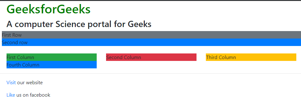
- Extra large

Column Resets: With the four tiers of grids available, we are bound to run into issues where at certain breakpoints, the columns don't quite clear right as one is taller( has more text) than the other column. A command called clearfix is there which fixes any issues regarding that viewport. We just need to write a div command with class clearfix after the block where the column isn't clearing right.
Let's say we have an issue with the md and sm viewport. But if we are using
But then it is causing problems for other viewport (maybe lg and xs) . So, what we can do is make clearfix visible only for the md and sm block or hide all other blocks (lg and xs).
or
Columns Offset: We can move the columns to the right by x columns using col-md-offset-x in the class.
<div class="col-xs-3 col-sm-4 col-md-6 col-lg-1 col-lg-offset-2">
This change results in making an offset of 2 grid columns before the fourth column.
Nesting Columns: For nesting columns within a column, we need to add a new row and set of columns. Nested rows should include a set of columns that add up to 12 or less than that.
Example: html <!DOCTYPE html> <html lang="en"> <head> <title>Bootstrap Example</title> <meta charset="utf-8"> <meta name="viewport" content="width=device-width, initial-scale=1"> <link rel="stylesheet" href= "https://maxcdn.bootstrapcdn.com/bootstrap/4.3.1/css/bootstrap.min.css"> <script src= "https://ajax.googleapis.com/ajax/libs/jquery/3.4.0/jquery.min.js"> </script> <script src= "https://cdnjs.cloudflare.com/ajax/libs/popper.js/1.14.7/umd/popper.min.js"> </script> <script src= "https://maxcdn.bootstrapcdn.com/bootstrap/4.3.1/js/bootstrap.min.js"> </script> </head> <body> <header> <div class="container"> <h1 style="color: green">GeeksforGeeks</h1> <strong> A computer Science portal for Geeks </strong> </div> </header> <div class="container"> <div class="row"> <div class="bg bg-secondary w-100"> First Row </div> </div> <div class="row"> <div class="bg bg-primary w-100"> Second Row </div> </div> </div> <br/> <div class="container"> <div class="row"> <div class="col-xs-2 col-sm-6 col-md-3 col-lg-4 col-xl-6"> <div class="bg bg-success"> First Column </div> </div> <div class="col-xs-2 col-sm-6 col-md-3 col-lg-4 col-xl-6"> <div class="bg bg-danger"> second Column <div class="row"> <div class="col-md-3 col-lg-4 col-xl-6"> <div class="bg bg-success"> First Nested Column </div> </div> <div class="col-md-3 col-lg-4 col-xl-6"> <div class="bg bg-primary"> Second Nested Column </div> </div> </div> </div> </div> </div> </div> <footer> <hr/> <div class="container"> <p> <a href="https://www.geeksforgeeks.org/"> Visit </a> our website </p> <p> <a href="https://www.geeksforgeeks.org/"> Like </a> us on facebook </p> </div> </footer> </body> </html>

Similar Reads
BootStrap Introduction and Installation To begin Web development you may go through this article first. Grid SystemButtons, Glyphicons, TablesVertical Forms, Horizontal Forms, Inline FormsDropDowns and Responsive TabsProgress Bar and JumbotronBootstrap is a free and open-source collection of tools for creating websites and web application
4 min read
Bootstrap Grid System Introduction and Installation Buttons, Glyphicons, Tables Vertical Forms, Horizontal Forms, Inline Forms DropDowns and Responsive Tabs Progress Bar and Jumbotron Prerequisites: Web Development Basics and  BootStrap (Part-1) Grid System: In the previous article we had learnt about Bootstrap and its I
7 min read
Bootstrap Buttons, Glyphicons, Tables After the previous article, one should be familiar with the Grid System of Bootstrap. Now, we'll learn about making Buttons, the all-new Glyphicons and Tables. Let's get started.Bootstrap ButtonsBootstrap buttons provide a quick way to create consistent and responsive buttons using predefined classe
3 min read
Bootstrap Forms Alignment Types Bootstrap Forms are pre-styled HTML forms provided by the Bootstrap framework. They streamline the process of creating aesthetically pleasing and responsive forms by offering a range of ready-to-use components, layouts, and styles, ensuring consistency and efficiency in web development. Bootstrap Fo
3 min read
Bootstrap DropDowns and Responsive Tabs Introduction and InstallationGrid SystemButtons, Glyphicons, TablesVertical Forms, Horizontal Forms, Inline FormsProgress Bar and Jumbotron Dropdown Menu Using Bootstrap: In bootstrap, dropdowns are created using the class="dropdown". What we will do is create a button and then convert the button in
3 min read
Bootstrap Progress Bar and Jumbotron BootStrap articles : Introduction and Installation Grid System Buttons, Glyphicons, Tables Vertical Forms, Horizontal Forms, Inline Forms DropDowns and Responsive Tabs Progress Bar We all have seen a progress bar while executing some process in our computer. A progress bar shows how much of the proc
2 min read
Bootstrap Alerts , Wells, Pagination and Pager Introduction and InstallationGrid SystemButtons, Glyphicons, TablesVertical Forms, Horizontal Forms, Inline FormsDropDowns and Responsive TabsProgress Bar and Jumbotron Alerts: We often see certain alerts on some websites before or after completing an action. These alert messages are highlighted tex
4 min read
Bootstrap Badges, Labels, Page Headers Introduction and InstallationButtons, Glyphicons, TablesVertical Forms, Horizontal Forms, Inline FormsDropDowns and Responsive TabsProgress Bar and Jumbotron Badges: We all have seen some numerical indicators beside some links on various websites. These are called badges. These badges tell how many
3 min read
Bootstrap Tooltips In this article, we would be discussing the tooltip plugin provided by bootstrap. Tooltip is quite useful for showing the description of different elements in the webpage. Tooltip can be invoked on any element in a webpage. Tooltips on bootstrap depends on the 3rd party library Tether for positionin
4 min read
Bootstrap Navigation Bar Bootstrap Navigation Bar provides a responsive, customizable, and pre-styled navigation component for web applications. It incorporates features like branding, navigation links, dropdowns, and responsiveness, enabling developers to create effective and visually appealing navigation menus effortlessl
6 min read